Led the UX team through a redesign of a fragmented internal insurance application used across the company. Standardized workflows and reusable components reduced design-to-development handoff time by 40%, achieved 90%+ usability satisfaction, and secured Phase 2 funding from executive leadership.
This project, which is covered by a Non-Disclosure Agreement (NDA), restricts the sharing of detailed information and visuals. However, I can share an overview of my contributions, design approach, and the project's impact.
Role: Lead UX/UI Designer
Company: Optum Advisory
Team: PMs, Engineers, Offshore UX Team, Business Stakeholders
Bryce Nichols
Senior UX Engineer at Optum
“I had the opportunity to work with Mara on an upgrade project at Optum, where we collaborated closely to refine and elevate the design experience. Mara was highly receptive to feedback and consistently demonstrated a strong ability to iterate and improve her work. I partnered with her to review designs and fine-tune details, ensuring the solutions were both thoughtful and aligned with user needs and business goals. Together, we worked through updates with stakeholders, leading discussions with the business to align on changes and direction. She also played a key role in bringing the work to life through an interactive prototype, which we used for user testing to validate our approach and gather meaningful insights. Mara is collaborative, detail-oriented, and committed to delivering high-quality work. I’d gladly work with her again.”
The Project
The Product: An inquiry management application within a multi-system insurance platform used by 100+ insurance processors at a major healthcare company.
The Users: Internal operations teams who process healthcare inquiries affecting millions of members daily.
The Company Stage: Large enterprise (Fortune 500) with legacy systems and technical debt, seeking to modernize their operations infrastructure.
My Role: Lead UX/UI Designer leading an offshore team through a 7-month consulting engagement at Optum Advisory.
The Challenge
Operational case managers couldn't complete a single workflow without:
Switching between 5 different applications
Re-entering the same data multiple times
Managing multiple login credentials
Manually tracking work in Excel alongside digital tools
New employee training took 2x longer than the industry standard because the system was so fragmented.

THE PROBLEM: Five Disconnected Systems
Participant #2, 3 years experience
"I have to switch between applications, and when I try to enter information in this application, it disappears and I have to type it again…"
My Design Approach
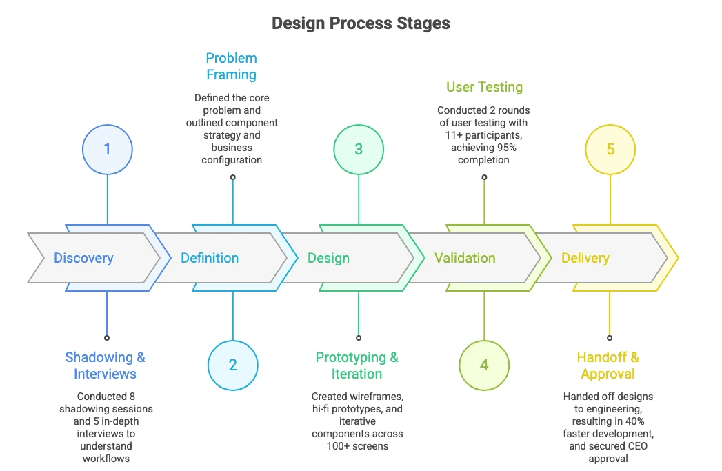
Discovery
What I did:
8 user shadowing sessions observing real workflows in action
5 in-depth interviews with processors across experience levels
Usage analytics analysis to identify friction points
Workshop with the UX team to map all workflow scenarios
What I discovered:
The business team had documented 2 workflow scenarios. In reality, there were 15+ variations involving:
3 user roles with different permission levels
3 legacy systems with incompatible data formats
4 state-specific regulatory requirements
Coordination across multiple departments
Key Insight
Users had devised undocumented workarounds, including pasting screenshots into Excel spreadsheets and maintaining personal notes to recall which system contained specific data.

Complex workflow requiring coordination across 3 roles, 3 systems, and 4 state-specific requirements

An example of user mappings: a future-state workflow that focuses on multiple users and different levels of authorization.
Design Strategy & Principles
Based on research insights, I grounded the design in a few core principles:
Reduce Cognitive Load: Keep interfaces simple and predictable
Enable Scalability: Design patterns that grow with the product
Design for Accessibility: Embedded WCAG standards across components
Support Engineers: Create reusable components for faster delivery


Key Decisions & Trade-offs
Standardization vs. Customization
Prioritized consistent patterns over per-team customization to reduce cognitive friction and streamline handoffs.
Progressive disclosure vs. Dense dashboards
Early designs showed too much at once, so we moved toward progressive disclosure to focus users on core tasks first.Speed vs. Full detail
Optimized for quick task completion, accepting that less frequent deeper actions would require additional navigation.

Design Iteration: Benefit Quote Request Screen
Low-fidelity wireframe showing benefit quote request workflow
How the Solution Took Shape
Unified Task Panel vs. Separate Views
Users needed to see inquiry details, member information, and authorization status simultaneously. I evaluated three approaches:
❌ Option A: Modal Overlay
Modal overlay for each subtask (keeps main screen clean)
Would force constant open/close/navigate
Users lose context when modal closes
Can't compare data across sections

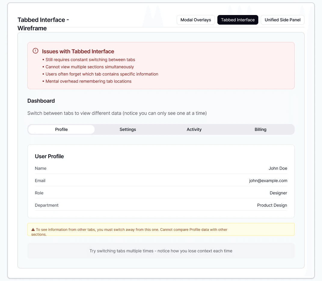
❌ Option B: Tabbed Interface
Tabbed interface switching between views
Still requires switching, just fewer clicks
Users can't see multiple data points at once
Testing showed users forgot what tab held what info
✅ Option C: Unified Side Panel
Unified side panel with collapsible sections
All relevant data visible in one view
Users can expand/collapse based on task needs
Maintains context throughout workflow
Testing showed 95% task completion with this approach
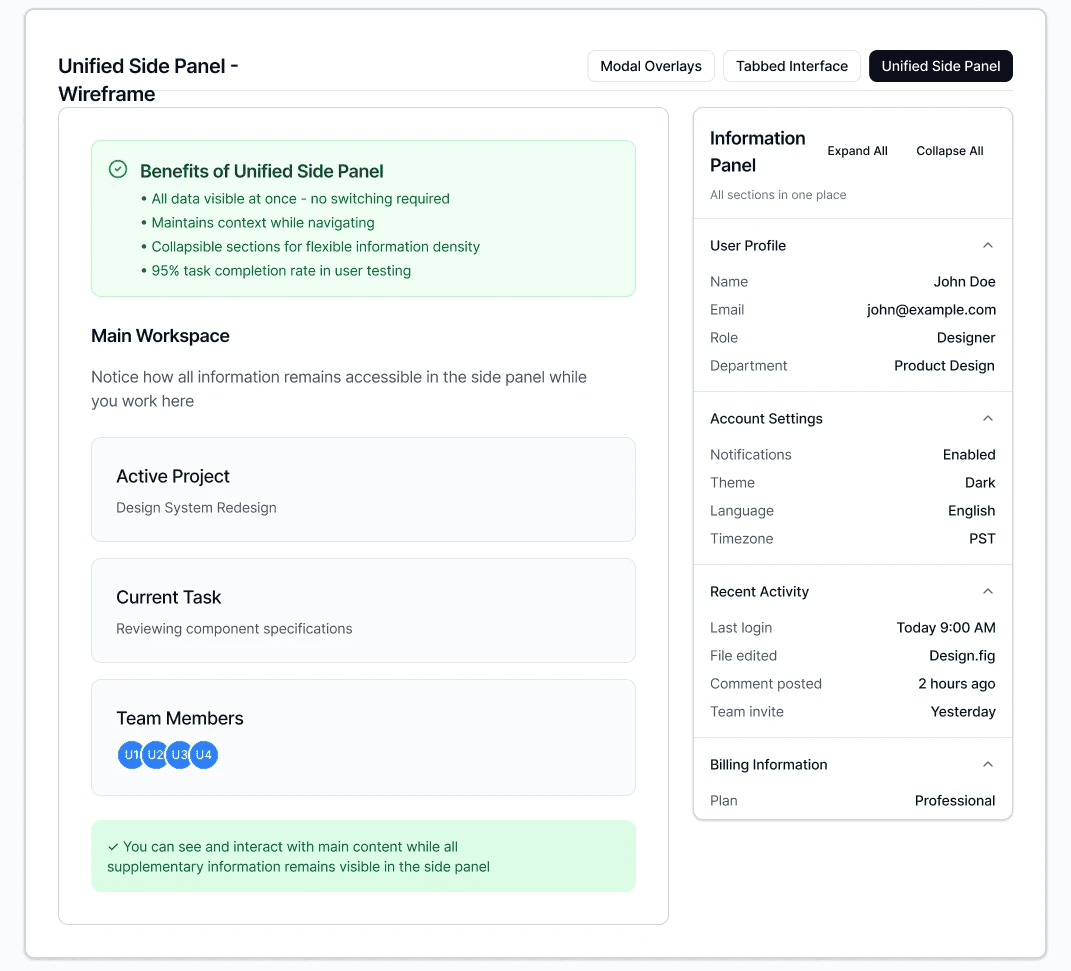
Validation
In usability testing, processors with Option C completed tasks without errors and provided overwhelmingly positive feedback.
Accessibility Iteration
What broke: During accessibility review, some font colors failed WCAG 2.0 AA contrast requirements on darker backgrounds.
My response:
Immediately updated accessible color palette
Added iconography to all status messages (redundant encoding beyond just color)
Updated all components using same color for consistency
Re-validated with automated tools + manual testing
Impact
Achieved WCAG 2.0 AA compliance while enhancing comprehension for all users, not just those with visual impairments.
"It's very easy to use. I can use it now, especially since we are in the busy month..."
The Solution
We delivered a unified application with guided workflows, replacing five fragmented systems with a single cohesive experience. Users now follow clear pathways through each stage, with embedded contextual help and automated processes eliminating manual handoffs.

After: A single unified application that consolidates all upgrade benefit inquiry workflows.
Unified Workflow
Consolidated five applications into a single, guided experience with progress indicators and contextual help, eliminating platform switching entirely.
Component Library
30+ documented, reusable components with anatomy specs and accessibility features, reducing design-to-dev handoff time by 40%.
Business Configuration
Flexible system allowing business users to control workflows, validation rules, and field visibility without engineering dependency.
Impact & Results
0%
0%
Task Completion Rate in Usability Testing
0%
0%
Faster Handoff
Business Outcomes:
Secured CEO Approval & Phase 2 Funding: Design work directly contributed to budget approval for full implementation during the final presentation.
Contract Extension: Client has extended the engagement to support Phase 2 UI and API development.
Engineering Independence: Engineers implemented designs without ongoing design support, demonstrating documentation quality and thoroughness.
Eliminated Training Bottleneck: Intuitive workflows are expected to reduce new employee onboarding time significantly.
User Impact:
Eliminated constant platform switching and data re-entry that disrupted task flow
Automated manual processes that previously doubled user effort
Provided clear navigation and embedded guidance, reducing reliance on training and support tickets
Enabled confident decision-making through better information architecture and workflow design
What Drove Our Success
Iterative component approach - Building alongside prototypes (not upfront) ensured every pattern solved real problems
Stakeholder cadence - Bi-weekly presentations to 15-20 people including C-suite kept alignment and built trust
Mid-stream adaptability - Adding business configuration became key differentiator in the Phase 2 pitch
What I'd Optimize Next Time
Earlier developer collaboration - Involving engineers during component creation would catch constraints sooner
Continuous Guerrilla Testing - Our two formal usability testing rounds were thorough, but quick hallway tests between rounds would have identified small issues faster, especially accessibility concerns that we caught late. I would schedule weekly 15-minute guerrilla tests with available users
Documented Decision-Making Framework - I made dozens of strategic design decisions, such as choosing a component-first approach over three alternatives. Still, I did not systematically document the reasoning and trade-offs at the time. I would create a simple "decision log" in real-time for future reference and team knowledge sharing
Let's Work Together
Contact