I was brought in to redesign liveandworkwell.com in 2023 with the OBH XD team. One of my main responsibilities was redesigning the "Get Care" navigation for a behavioral health platform serving millions. I applied the Jobs-to-be-Done framework and the tabs component, achieving an over 40% improvement in task completion rate through A/B testing. Launched in January 2024, the redesign reduced support tickets and improved task completion for users seeking mental health support.
This project, which is covered by a Non-Disclosure Agreement (NDA), restricts the sharing of detailed information and visuals. However, I can share an overview of my contributions, design approach, and the project's impact.
Role: UX Designer
Company: Optum Behavioral Health
Team: 4 designers, 3 content strategists
The Project
Live and Work Well platform - a consumer-facing behavioral health portal serving millions of members seeking mental health and wellness resources at Optum, a multi-billion-dollar division within a Fortune 500 company.
The legacy system was causing poor retention. People came to the site looking for mental health support but couldn't figure out how to find care, resulting in users abandoning the platform in moments of crisis.
The Challenge
The platform was experiencing a significant decline in its user base. Individuals visited seeking mental health support but were unable to access appropriate care.
Redundant navigation with multiple confusing pathways
Disconnected experience - users couldn't tell what was available
"Find Care" page was buried and difficult to discover
No personalization - same generic content for all users
Poor user retention and high bounce rates on care-finding pages. Business was losing potential patients who gave up trying to navigate the system.
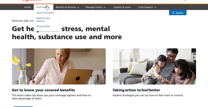
Legacy State: Find Care Navigation
Actual user feedback from research
"I came here to find a therapist, but I don't know where to start..."
My Design Process - Double Diamond Framework

Discovery: the Care Journey
Through analyzing quarterly reports, creating user personas, mapping journeys, and reviewing analytics, I discovered the core issue:
Critical discovery: Users don't think in terms of the organization's internal categories. They think: "I need to talk to someone today" or "I need to find a therapist near me." The navigation needed to match their mental model, not the company's org chart.
Key Insight
The "Find Care' page was missing, so users had to rely on the main navigation bar to discover care options. However, when they did find the "Find Care' menu, they were underwhelmed by three options without context and did not clearly explain what each category included.
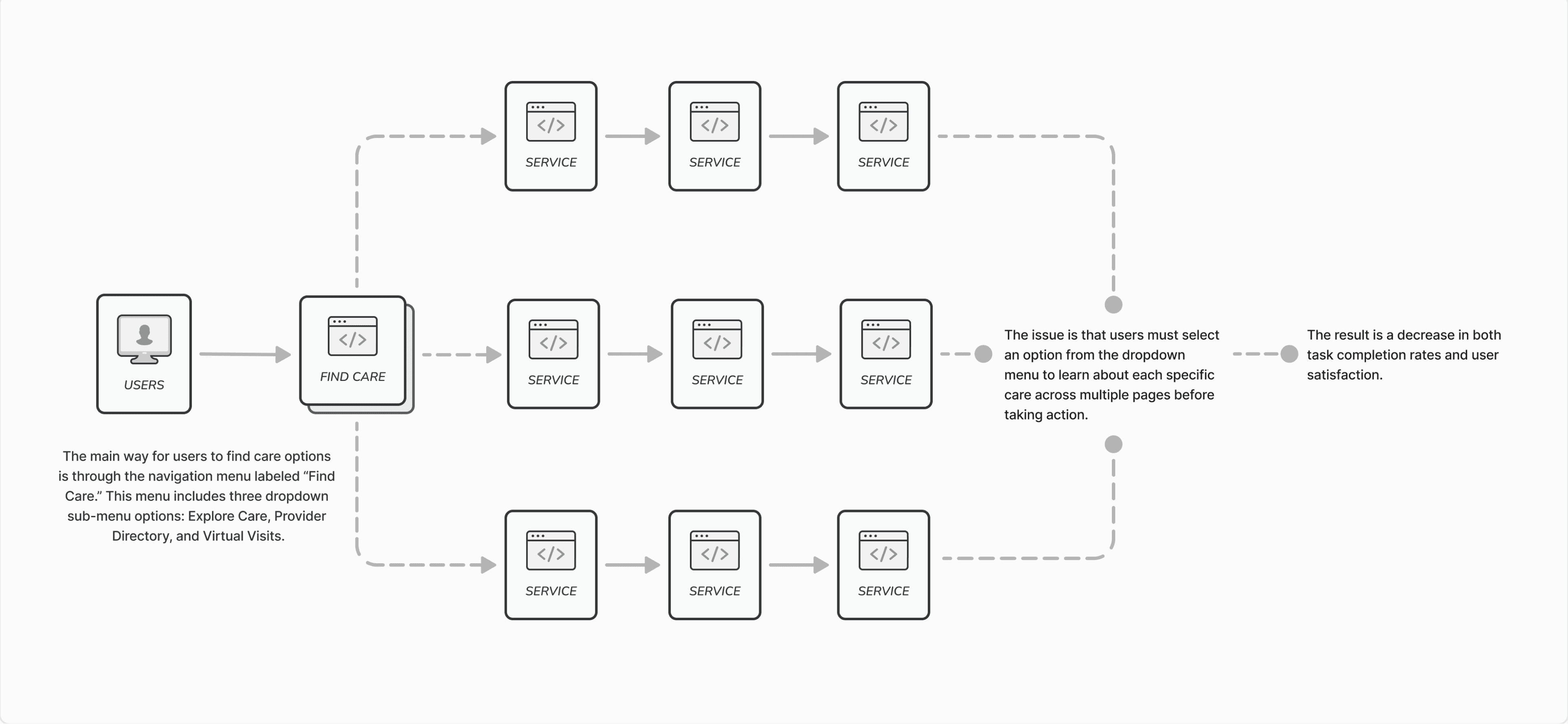
Legacy Version WorkFlow - “Find Care” Feature
Key Design Decision
Decision 1: Rename "Find Care" to "Get Care"
Why this matters: "Get Care" is action-oriented and immediate. "Find Care" is passive and suggests searching. For users in mental health crisis, "Get" conveys urgency and directness.
Alternative considered: Keep "Find Care" to avoid confusing existing users
Why we changed it:
Research showed new users didn't understand "Find Care"
"Get Care" tested better in card sorting exercises
More aligned with the Jobs-to-be-Done framework
Attracting new users was more important than familiarity

Decision 2: Jobs-to-be-Done Framework
I applied Jobs-to-be-Done framework to identify the actual "jobs" users were hiring the platform to do:
Job 1: "I need immediate virtual care today" → Virtual Visits tab
Job 2: "I need to find a therapist I can see regularly" → Provider Directory
Job 3: "I want to learn about my care options first" → Explore Care
By organizing around user goals, we created clear pathways that matched how people actually think about getting care.
Decision 3: Tabs vs. Separate Pages vs. Single Long Page
How to organize three main care pathways: Explore Care, Provider Directory, and Virtual Visits
Validation: The tabbed component was useful when looking for help.
Percentage rating the tab or section a 4 or 5 on a scale where 1= not at all useful and 5 = very useful.
We verified our hypothesis that the primary task should be the first tab option and most helpful for users seeking assistance. The results indicated that the high-rating check-in was indeed the first option, potentially influenced by its use in a previous task.
Accessibility improvements ensured inclusivity for diverse user groups.

The Solution
We delivered a reimagined "Get Care" experience that transformed how millions of users access behavioral health services:
Centralized Get Care Page
Consolidated all care-finding pathways into a single, intuitive hub:
Tabs component for clear organization (Explore Care, Provider Directory, Virtual Visits)
Personalized content based on user's membership and coverage
Prioritized top tasks aligned with Jobs-to-be-Done framework
Streamlined navigation eliminating redundant pathways
Clear Content Hierarchy
Actionable next steps with clear CTAs for each pathway
Plain language - no medical jargon or confusing terminology
Contextual help embedded where users needed it
Visual hierarchy with most important options surfaced first
Enhanced Discoverability
Elevated in main navigation
Featured on homepage
Clear labeling matching user mental models
Reduced clicks from landing page to care options

Design launched with accessibility - Consolidated care options into a single page with an accordion component for smaller screens

Design Before and After the Live and Work Well Platform
Impact & Results
0%
0%
User Confidence
A/B Testing Results
We conducted rigorous A/B testing comparing old vs. new Get Care experience:
80%+ confidence improvement in using the redesigned page
Faster task completion - users located care options more quickly
Top tasks section rated as "particularly useful" by testers
Clear preference for tabbed organization over separate pages
A study participant who gave the Live and Work Well - Find Care & Benefit
desktop prototype a 10/10.
“This was one of the best medical website designs I have ever seen. kudos to whomever designed it.”
What Drove Our Success
Jobs-to-be-Done Framework - Organizing content around user goals (not internal org structure) made the difference. By understanding the actual "jobs" users were hiring the platform to do, I created pathways that matched their mental models.
Content-Design Collaboration - Daily work with content strategist ensured every label, button, and microcopy was tested and validated. In healthcare, words matter - wrong terminology can scare or confuse users in vulnerable moments.
Iterative A/B Testing - Testing early and often with real users prevented us from launching based on assumptions. The 87% confidence improvement came from listening to user feedback and iterating.
What I'd Optimize Next Time
Earlier Technical Validation - Some design ideas had to be simplified due to technical constraints discovered late. Next time, I'd involve engineering earlier in the ideation phase to understand feasibility upfront.
More Extensive Post-Launch Metrics - While we had A/B testing data pre-launch, I would have instrumented more detailed analytics post-launch to measure actual behavior changes over time (retention rates, care completion, etc.).
Let's Work Together
Contact