J&J Global Product Information Platform (PoC)
Focusing on the "Get Care" navigation

Transforming static product labels into an interactive digital experience
This project, which is covered by a Non-Disclosure Agreement (NDA), restricts the sharing of detailed information and visuals. However, I can share an overview of my contributions, design approach, and the project's impact.
The Project Overview
Role | Senior UX Designer (Contract) |
|---|---|
Company | Global Pharmaceutical Corporation |
Timeline | 12 weeks |
Team | Global UX Teams, IT Leaders, Developers (3), Product Manager (1), Business Stakeholders (multiple regions) |
Deliverables | MVP Proof-of-Concept, Executive Demo, Future Roadmap |
Status | Executive approval secured, Phase 2 funded |
The Business Challenge
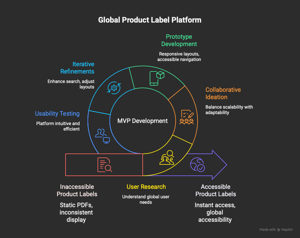
Understanding the Problem
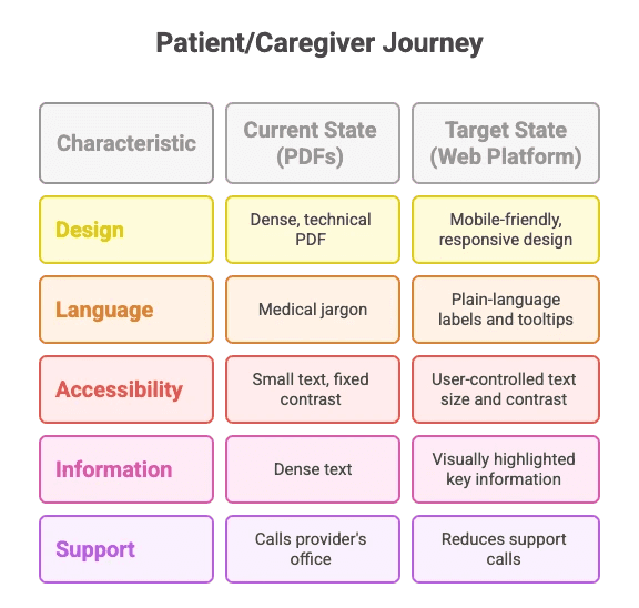
When I joined this project, the company distributed critical product information through paper documents and static PDFs. This legacy approach was creating significant operational challenges and user friction.
The MVP requirement set out to create a responsive web app platform that would:
Replace PDFs and physical labels with an interactive, web-based solution.
Ensure global accessibility with multilingual support and compliance with accessibility standards.
Deliver scalability for future features and regional customizations.
This platform would serve as the foundation for a global launch, ensuring a consistent yet adaptable experience for users across diverse markets.
Timeline
The project was completed in 12 weeks:
Weeks 1-2: Research & Strategic Alignment - Conducted comprehensive stakeholder interviews, competitive analysis, and established a shared understanding of the problem space.
Weeks 3-4: User Flow Development - Mapped user pathways through the platform. Developed rapid concept sketches exploring different navigation approaches. Focused on differentiating from PDF mental models while maintaining intuitive access patterns.
Weeks 5-6: Wireframe Creation - Translated concepts into structured wireframes. Made critical decisions about feature prioritization and information architecture. Regularly validated direction with stakeholders to ensure alignment with their evolving understanding of platform benefits.
Weeks 7-8: Interactive Prototyping - Developed high-fidelity Figma prototypes that felt like real products. Created demo versions for stakeholder review. Iterated rapidly based on feedback, demonstrating advantages over PDF approach in each review.
Weeks 9-12: Design Specifications & Validation - Created comprehensive design documentation for development handoff. Conducted comparative usability testing (PDF vs. platform). Delivered Phase 2 roadmap showing evolution path.
The Approach
Understanding Global User Needs
I began with comprehensive user research, focusing on key questions:
What do users in different regions expect from a product label platform?
How can we simplify navigation for users with varying levels of digital literacy?
What challenges arise when accessing large amounts of content in multiple languages?
Through interviews and competitive analysis, I identified universal pain points:
Difficulty navigating static PDFs or lengthy documents.
Frustration with inconsistent content display across devices.
A need for robust search functionality to handle multilingual queries.
Collaborative Ideation
As the only designer, I collaborated with:
Global UX Teams to understand cultural and regional differences.
IT Leaders and Developers to define technical constraints and opportunities.
Stakeholders to align on business goals and prioritize MVP features.
I took on collaborative ideation, using methods like Crazy 8’s for rapid idea generation and ‘How Might We’ questions to reframe challenges into opportunities. Using FigJam and other collaborative tools, I sketched ideas, developed workflows, and created wireframes that balanced global scalability with local adaptability.
Crafting the solution
Wireframe/Prototype Development
I started with a minimum viable product (MVP) to validate my ideas and ensure feasibility for a global audience. The MVP included:
Responsive Layouts: Optimized for desktops, tablets, and mobile devices.
Search Features: Designed to support multilingual and region-specific queries.
Accessible Navigation: Built to meet WCAG standards for inclusivity.
Iterative Refinements
Through regular feedback sessions, we:
Enhanced the search function to handle linguistic nuances.
Adjusted layouts to ensure consistent readability across screen sizes.
Incorporated user feedback to improve the clarity.
Validate the experience
Usability Testing
User testing became our compass, guiding the final stages of the project. The UX manager and I planned and facilitated sessions, asking participants to complete tasks such as searching for information and navigating large datasets.
Validated Results
Ease of Use: All participants found the platform intuitive and efficient.
Navigation Success: Users quickly grasped how to move through content.
Visual Feedback: 80% of users appreciated dynamic styling for important information, leading to a global design tweak for better readability.
The Outcome & Next Steps
In 12 weeks, the project successfully positioned the product labels on a global scale, with an MVP that impressed stakeholders and obtained funding for the next development phase.
For the end-users, the solution transformed how they interacted with product labels, offering:
Instant Access: A web-based platform that eliminates reliance on downloads and physical documents.
Global Accessibility: A design that complies with accessibility standards built to adapt to diverse markets and user needs.
Future-Proofing: A scalable structure ready to grow with the platform's global ambitions.
Along with the MVP, I delivered a roadmap for future enhancements, including customization options and additional features to elevate the user experience further.
As the team moves forward, the focus will be to further understand global users by facilitating user testing sessions across regions and collecting diverse perspectives by asking participants to navigate the app and rate their experience.
Retrospective
I learned that the proof-of-concept didn't have to be a complete platform; it only needed to show that the design was feasible and valuable. The 12-week timeline prevented scope issues and enforced strict prioritization. This limit actually improved strategic clarity and decision-making by removing the option for endless refinement.
Read my projects:
"Mara is a fantastic designer. I’m a content designer, UX writer, and Mara mega-fan. We worked together on multiple projects together at Optum from complex user flows with tricky stakeholder requirements to a redesign of our website’s main strategy and entry points. Mara was consistently curious, receptive, insightful, and productive. I would work with her again in a heartbeat."
Kate Hitchcock, Senior UX Designer at Optum
"Holy smokes, every now and then you come across a teammate who just blows expectations out of the water and DELIVERS! Mara is one such person. We brought Mara in to help deliver on a highly visible product with a seriously challenging timeline in complex space with an impact to millions of users. Mara showed a balance of curiosity, problem solving and tactical execution that outshines many people with more senior titles and I can truly say we could not have launched without her. Added to that, Mara is truly delightful human and partner to work with. I recommend her without hesitation."
Matthew Cooper, Senior Product Designer at National Grid
"I would definitely recommend Mara. I have worked with her at The Hartford, and while on the team with her, I observed that she has great design ideas, she is highly motivated and has a great attitude for pushing great design. She is approachable, asks the right questions to fully understand the assignment at hand, and is a great addition to the team."
© Created by Mara Suwannawat. 2025