Case Study | Optum | 2025
Consolidated legacy enterprise systems into a cohesive workspace.
How leading an offshore UX team at Optum Advisory, I partnered with products to redesign an internal benefit inquiry workflow — replacing five disconnected legacy applications and manual Excel tracking with a single unified workspace — validated through 95% task completion and CEO-approved Phase 2 funding, in 7 months.
Enterprise B2B
Internal App
Legacy System Integration
Design System
Usability Testing
Accessibility (WCAG 2.0)
Figma
95%
TASK COMPLETION
In formal usability testing
40%
FASTER HANDOFF
Design-to-dev vs. legacy process
5 → 1
SYSTEMS CONSOLIDATED
Legacy tools replaced by one workspace
Phase 2
FUNDING SECURED
CEO approval + contract extension
FRAMEWORK
My Role
Senior UX/UI Designer — led an offshore UX team through the full redesign
Team
1 Senior UX Designer (me) · offshore UX team · product & engineering partners · compliance and security stakeholders
Methods
Contextual shadowing, in-depth interviews, usage analytics analysis, workflow mapping workshops, iterative usability testing
Users
Primary users - Internal case managers processing benefit inquiries company-wide
Success Metrics
Task completion rate, design-to-dev handoff time, executive approval, new-hire training time
Process Arc
Discovery → workflow mapping → design principles → prototyping → usability testing → executive presentation → Phase 2 funding
DESIGN PROCESS
From five fragmented tools to one workflow
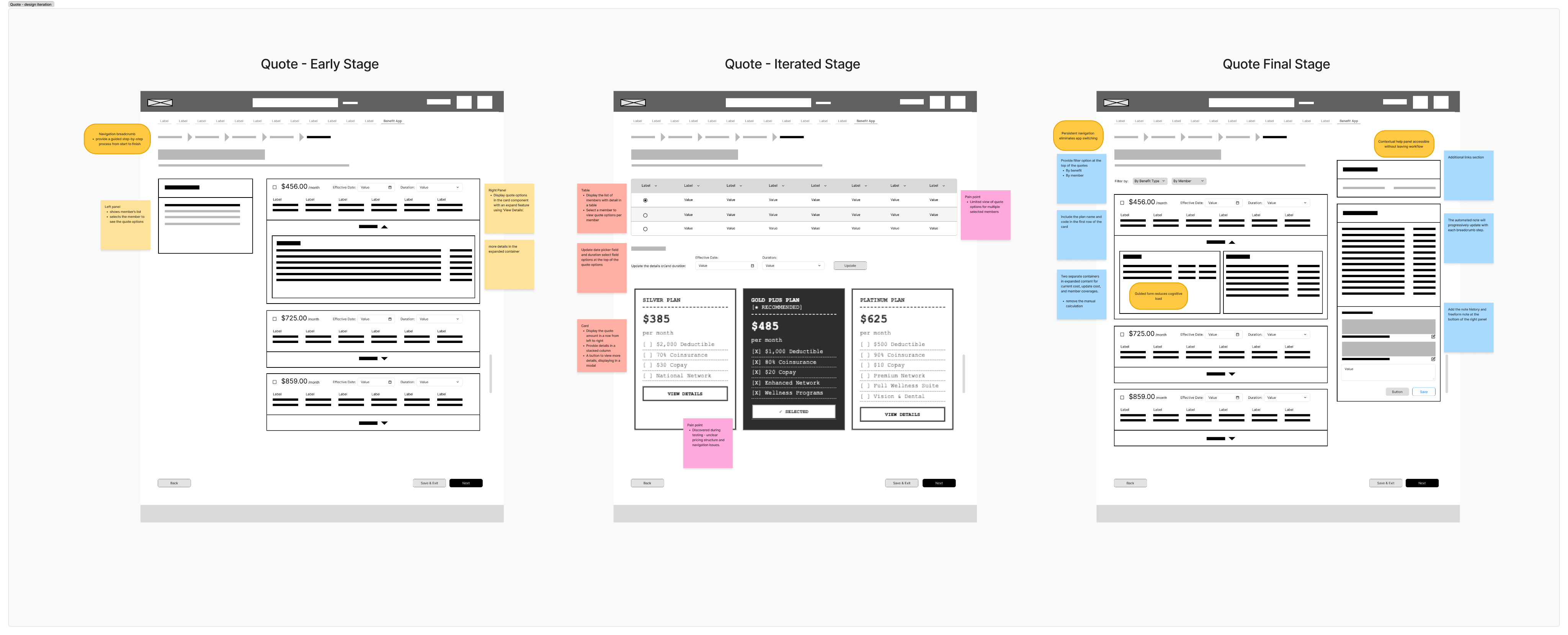
Rather than redesigning each legacy application in isolation, the process started by mapping the whole case manager journey across all five systems — surfacing where cognitive load, re-entry, and drop-off actually occurred. That map became the basis for a single, unified information architecture and a component system built to scale with it.
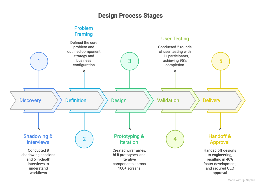
BEFORE → AFTER
Before

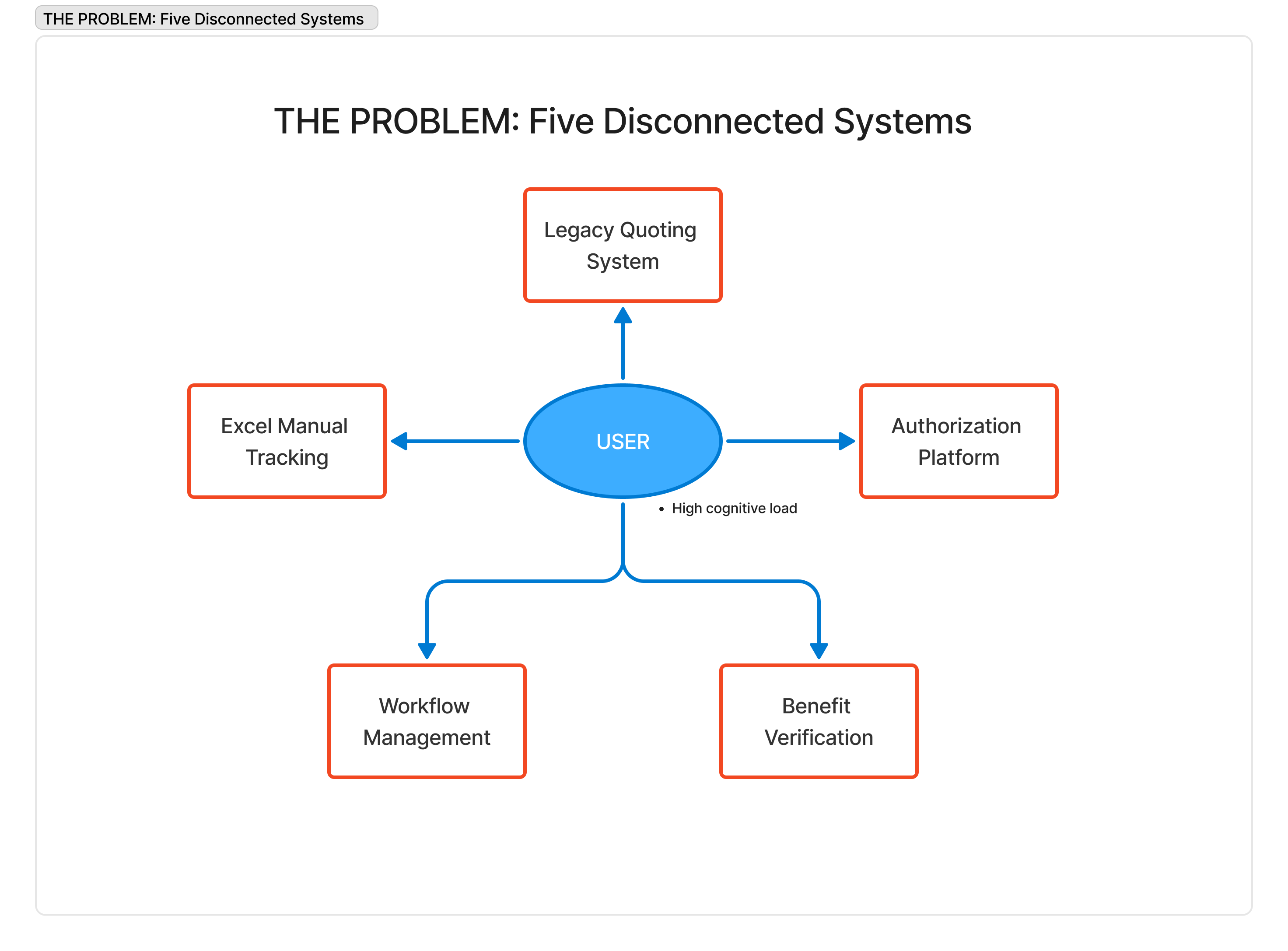
Case managers switched between 5 disconnected applications to complete a single inquiry.
Data had to be re-entered manually across systems, multiplying errors.
Supervisors relied on personal Excel trackers just to keep operational functionality.
Managing multiple login credentials added friction to every task.
No shared design system — every legacy tool looked and behaved differently.
New employee training took 2× longer than the industry standard because the system was so fragmented.
After

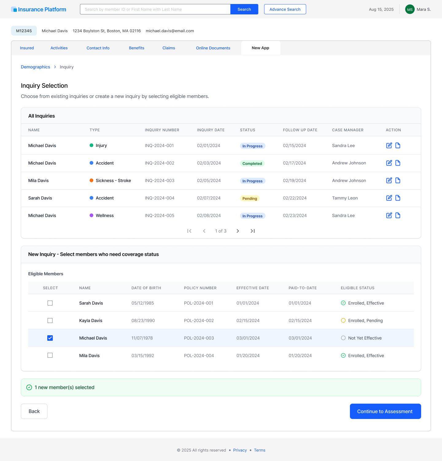
Consolidated 5 legacy tools into one unified workspace behind a single login.
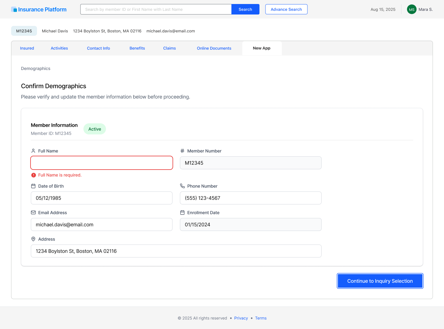
Pre-populated, persistent member context eliminated repetitive data entry.
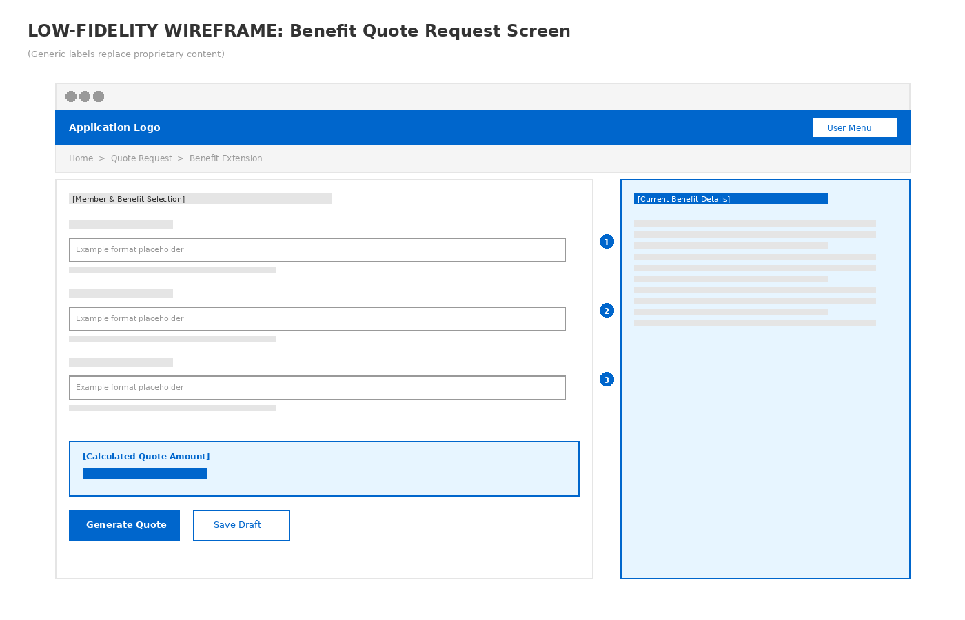
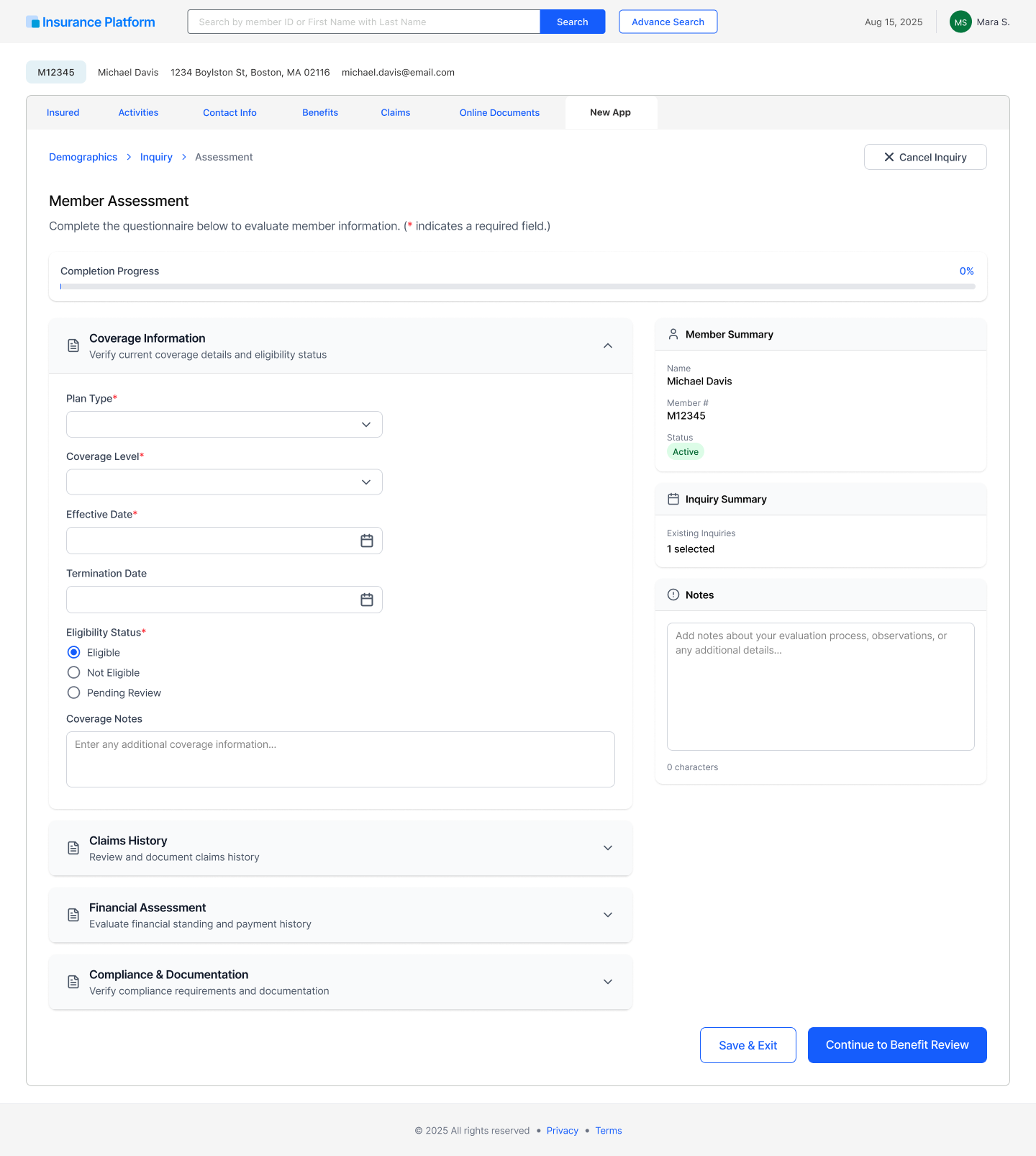
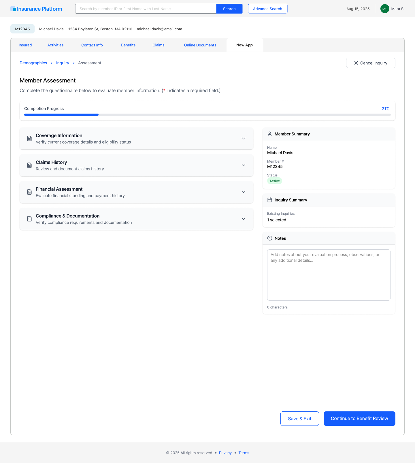
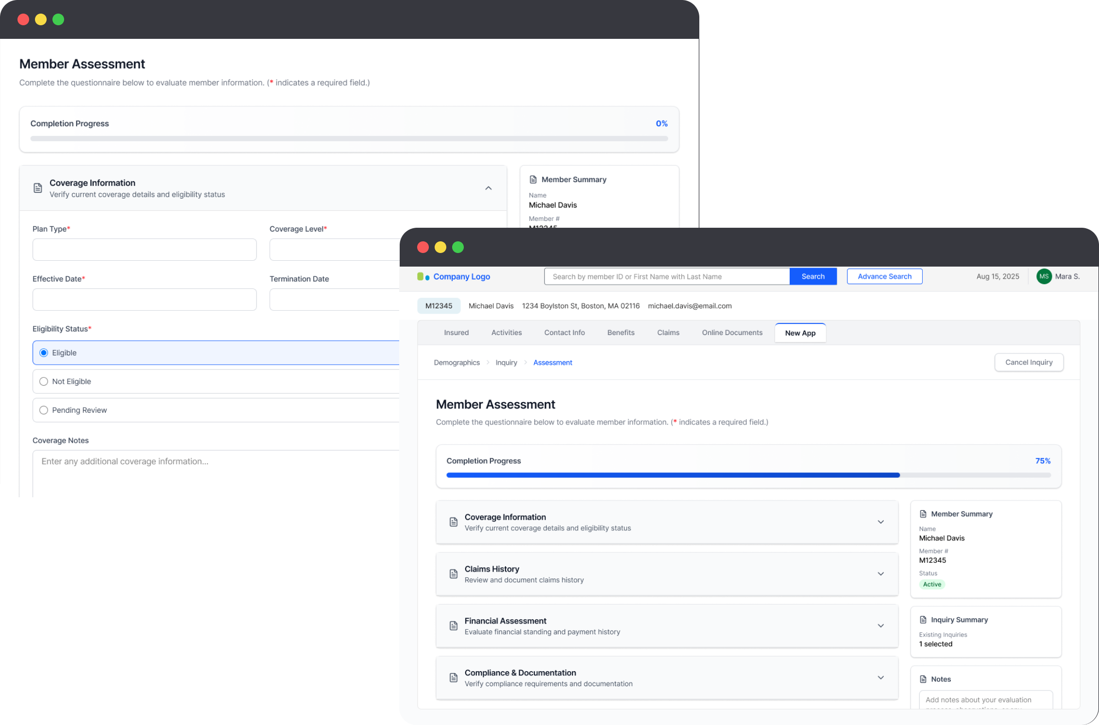
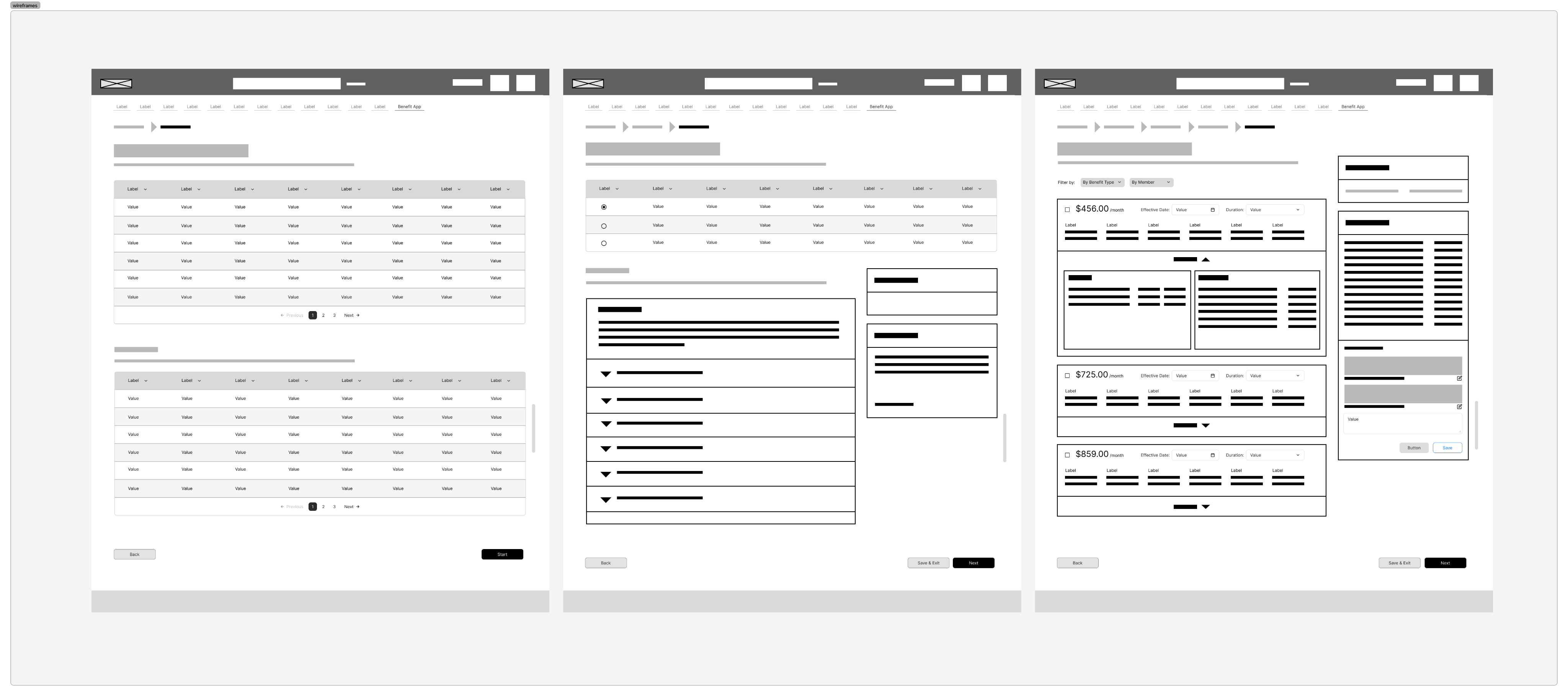
Unified side panel kept the form, member summary, and notes visible at once — no screen-switching.
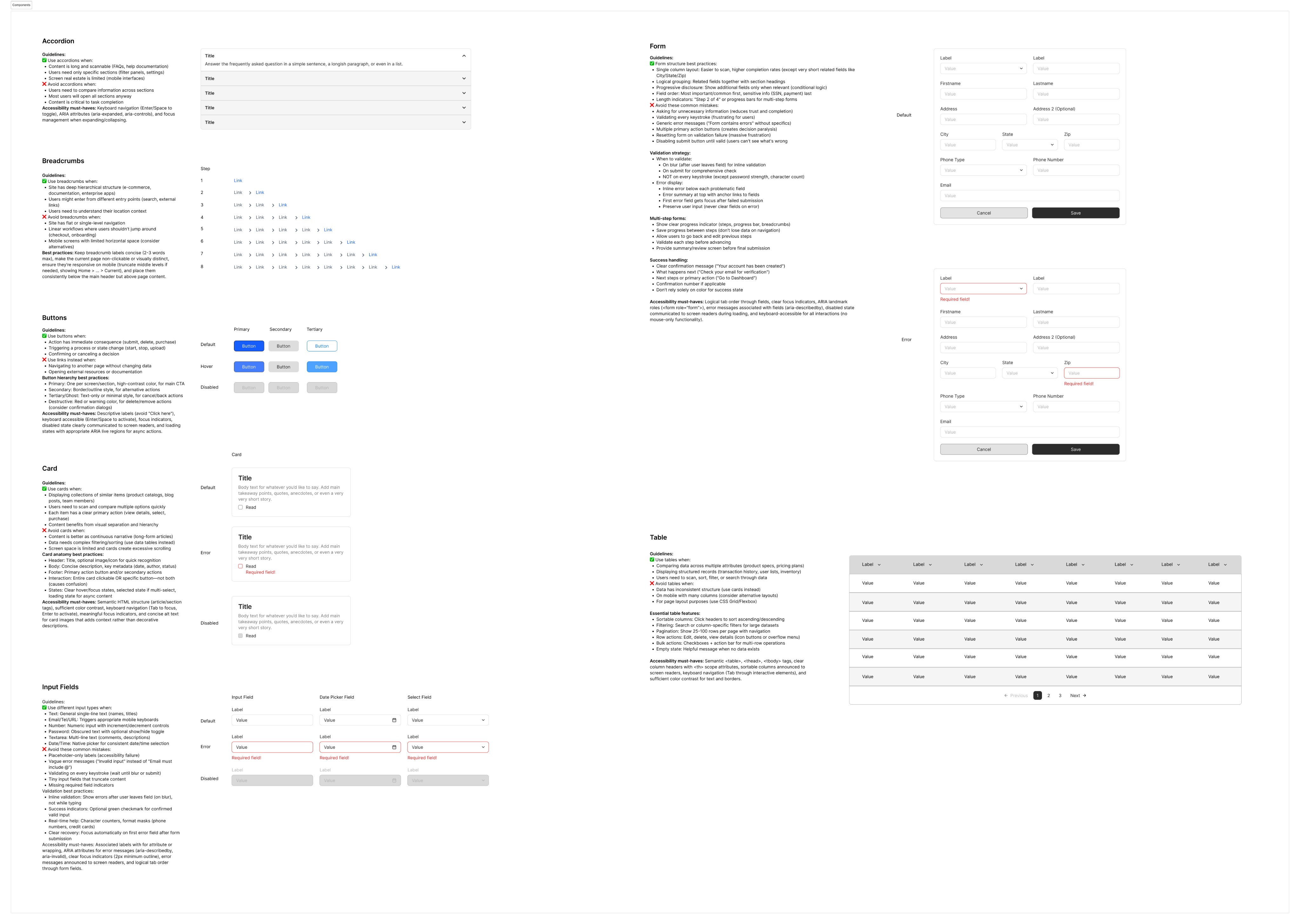
30+ component design system gave engineers a precise, reusable spec.
WCAG 2.0 AA accessibility built in from the start, even where legacy systems fell short.
95% task completion validated the new workflow in usability testing; design-to-dev handoff time dropped 40%.
CONSTRAINTS
LEGACY PLATFORM
Stakeholders chose to build within the existing platform to accelerate the timeline — inherited typography, color, and a 12-column grid from the existing framework had to carry into the new design.
REGULATORY (HIPAA)
PHI data handling required staying within certified infrastructure. Every component was reviewed for data exposure, and every action needed an audit trail for compliance.
STAKEHOLDER CADENCE
Biweekly presentations to 15–20 audiences (CEO, Operational Director, Managers, and end users) meant design decisions had to be defensible on a recurring cadence, not just at a single final review.
OFFSHORE COORDINATION
Leading an offshore UX team added a communication and handoff layer — specs had to be precise enough to survive time-zone and language gaps without design intent getting lost.
SCOPE
Five distinct legacy workflows — quoting, authorization, workflow management, benefit verification, and manual tracking — had to be reconciled into a single coherent IA.
TIME
Seven months to move from discovery through a working, tested, accessible system ready for CEO sign-off and Phase 2 funding.
KEY DECISIONS
One unified workflow, not five
User Journey Map showed users abandoning workflows at the same system-switching points observed during 8 shadowing sessions. Replacing five logins and five re-entry points with one workspace became the core hypothesis the rest of the design tested.
KEY DECISIONS
Unified side panel over modals or tabs
Three navigation patterns were tested head-to-head: a modal overlay, a tabbed interface, and a unified side panel. The modal caused the same context-loss problem as the original disconnected tools, just at a smaller scale. Guerrilla testing showed the tabbed interface made users forget which tab held which information. The unified side panel — form on the left, member summary and notes fixed on the right — won on all counts, achieving 95% task completion in formal testing.