Work

About

Mara Suwannawat

Open mobile menu

Benefits

Specifications

How-to

Contact Us

Learn More

Phone

Case Study | Optum | 2023

Redesigned 

behavioral health platform across every screen size

How a cross-functional UX team restructured navigation, redesigned high-complexity flows, and produced atomic-level component documentation across desktop, tablet, and mobile — so members could find and use behavioral health care without friction, on any device.

Customer-facing redesign

End-to-end

IA Restructure

Healthcare / Behavioral

Responsive Design

Enterprise B2B

Component Documentation

Figma

95%

TASK COMPLETION

Across usability test rounds

A/B win

NEW VS. LEGACY

Faster + fewer errors

↑ First-click

IA ACCURACY

Critical items surfaced vs. buried

6 streams

SCOPE

Landing · Get Care · Benefits · Onboarding · Info · Handoff Docs
Cityscape

FRAMEWORK

My Role

UX Designer, embedded on a cross-functional team via Turnberry Solutions consulting

Team

4 UX designers · 2 PMs · 3 content strategists · 1 accessibility specialist · dev team · behavioral health SMEs

Methods

A/B testing, first-click / last-click hierarchy testing, usability testing, user satisfaction surveys, UAT, soft launch

Users

Health plan members seeking behavioral health care — navigating benefits, providers, and available programs

Success Metrics

Task completion rate, navigation accuracy, user satisfaction, A/B test outcomes vs. legacy

Scope

Landing page, Get Care (provider search), Benefits Exploration, Onboarding & Eligibility, Instructional / Info pages, Navigation IA — designed across desktop, tablet, and mobile, with atomic-level component & behavior documentation for engineering handoff

Process Arc

Research → concept → pitch to business stakeholders → executive presentation → UAT → soft launch

DESIGN PROCESS

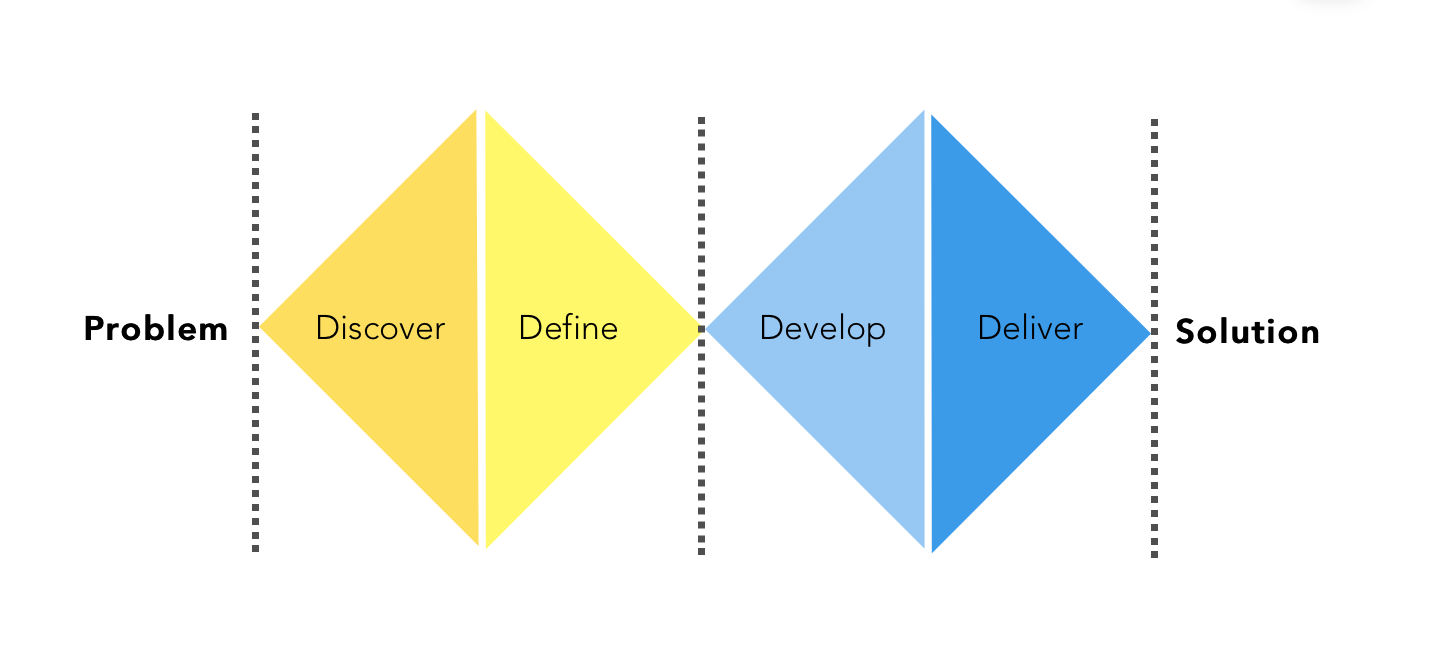
Double Diamond Framework
BEFORE → AFTER

  • Before

    View ‘After’

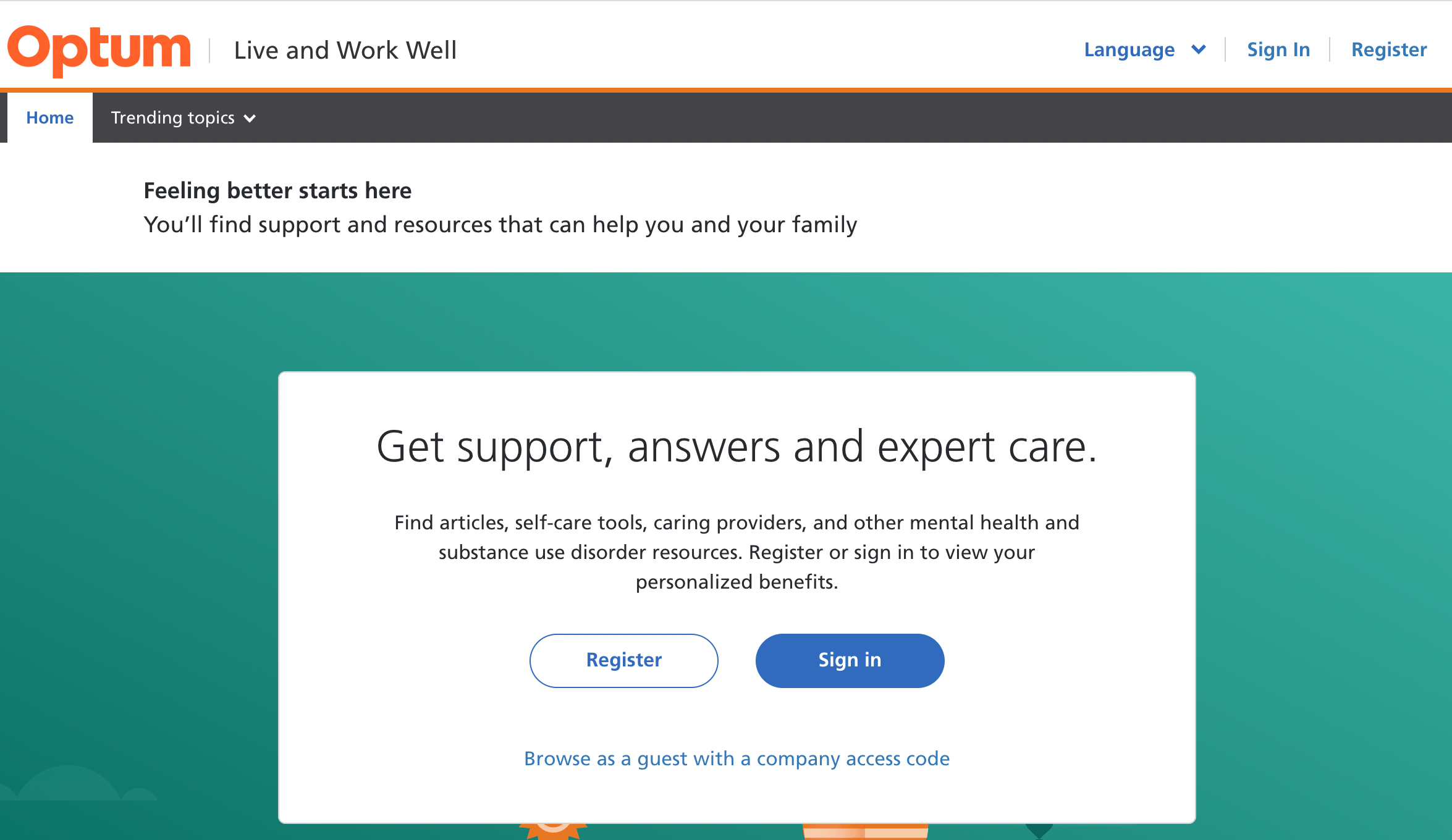
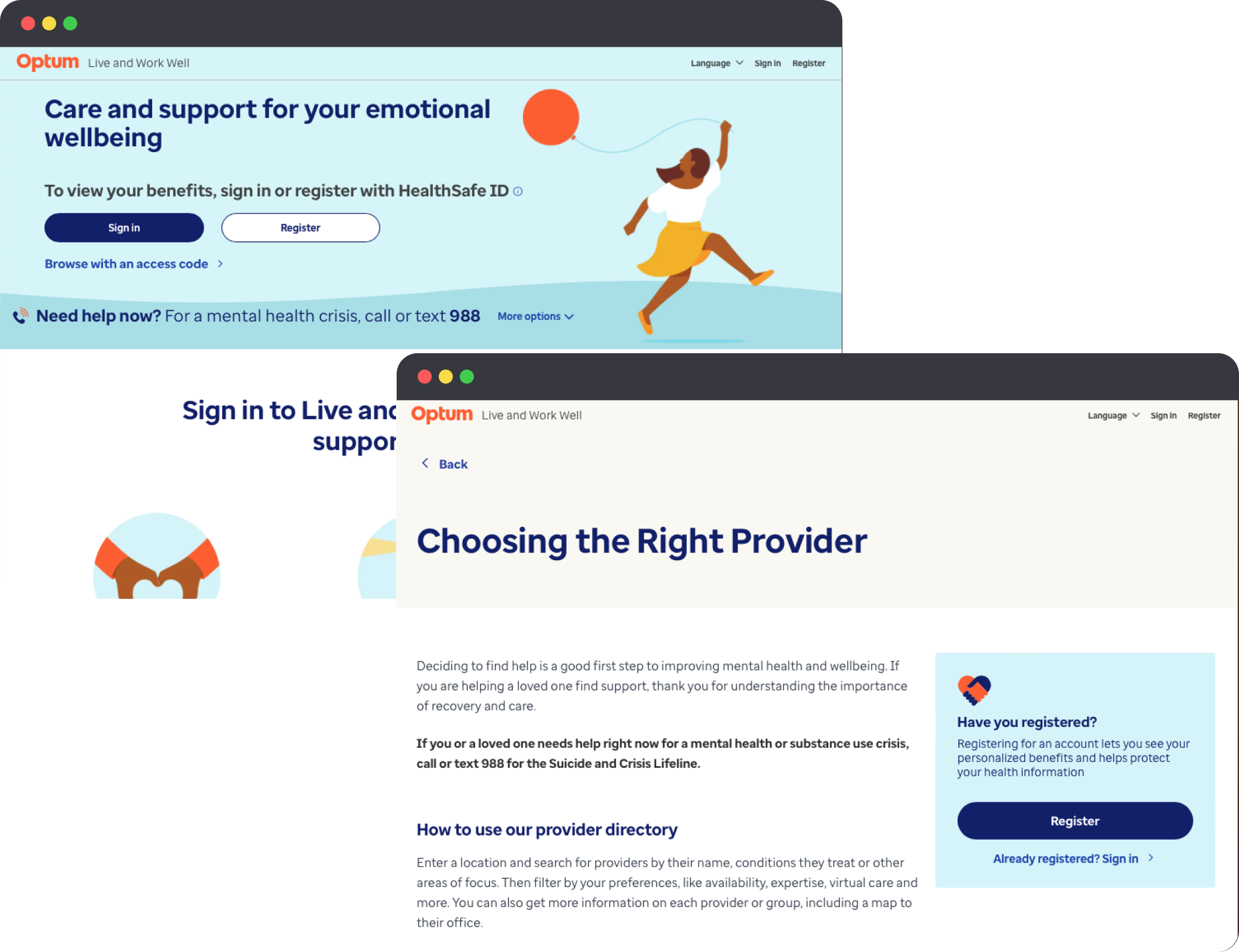
  • Instructional content was dense and unstructured — members couldn't scan to find relevant guidance quickly
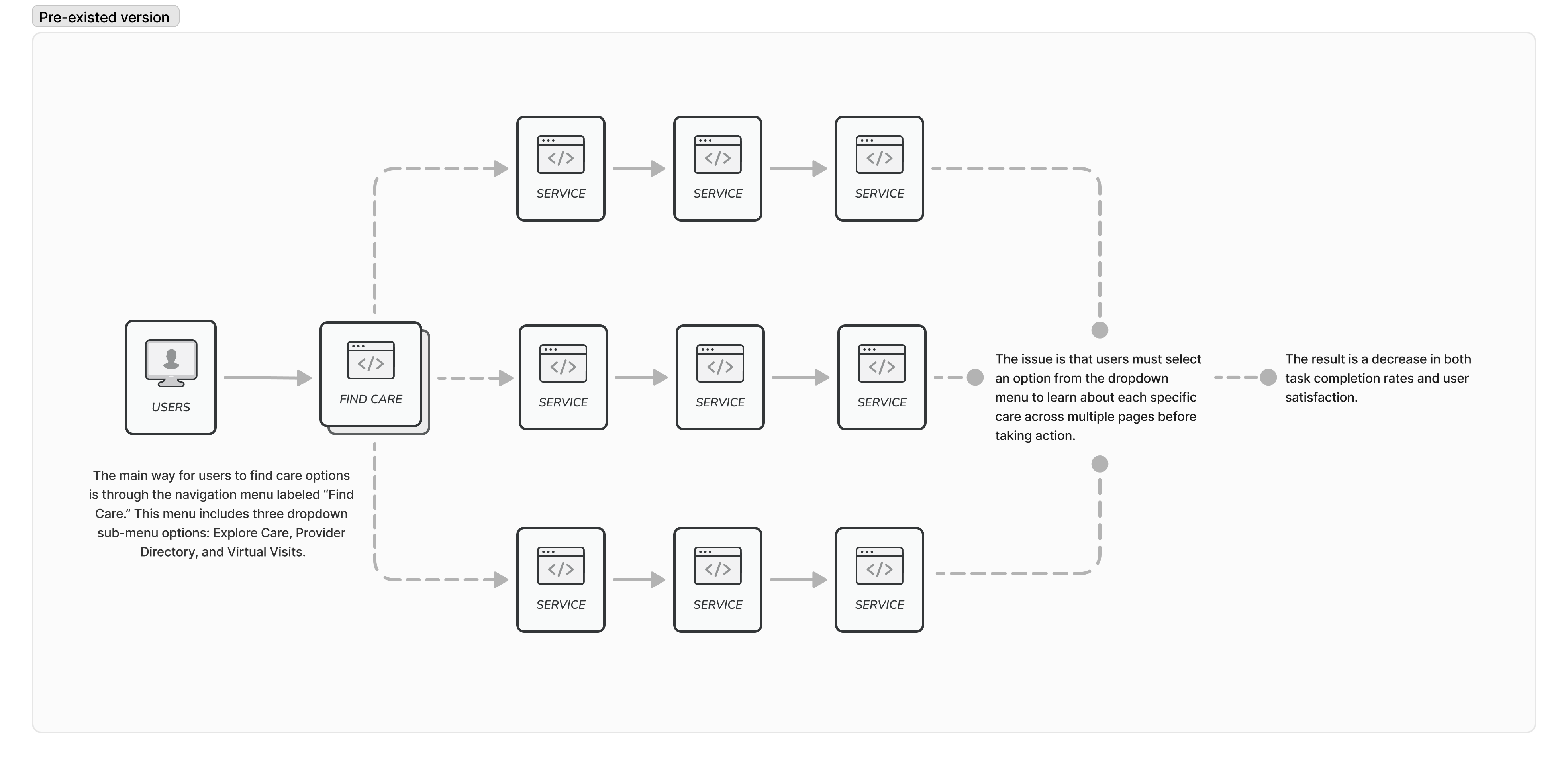
  • Navigation buried critical items — members couldn't locate Get Care or understand what benefits and programs were available without multi-step searching
  • Onboarding lacked eligibility confirmation — members entered the site uncertain about what their plan covered
  • Benefits exploration was buried and hard to parse — members couldn't quickly understand what programs, tools, or services their plan included
  • Inconsistent UI components across flows created visual noise and raised cognitive load on already-stressed users
  • No shared design language — each flow felt like a separate product, eroding trust and learnability
  • Landing page didn't orient new members — no clear entry point for understanding what the site offered or how to start.

CONSTRAINTS

RESPONSIVE

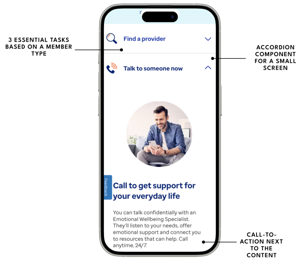
Every flow required full design coverage across desktop, tablet, and mobile breakpoints — navigation patterns, component behavior, and layout hierarchy had to hold up at all three sizes, not just desktop-first.

ORG

Behavioral health is a regulated, sensitive domain. Every content and UX decision touching clinical language, eligibility, or benefits required stakeholder alignment across compliance, clinical, and product — slowing iteration cycles.

TECH

The legacy site had deep technical debt and fragmented component patterns. New designs had to account for existing system constraints while establishing consistency — rebuilding from scratch wasn't an option.

SCOPE

Working across five parallel streams (Landing, Get Care, Benefits Exploration, Onboarding, Info pages) meant prioritization was constant — high-complexity flows required focused depth while the IA and handoff documentation work needed to stay in sync across all streams.

ACCESS

Recruiting behavioral health members for usability testing required careful protocols — HIPAA compliance and participant sensitivity limited session formats and recruitment channels.

TIME

As one of several designers on a large engagement, design decisions needed to be defensible quickly — A/B tests and hierarchy data had to do the persuasive heavy lifting in cross-team reviews.

KEY DECISIONS

Restructure the IA

Hierarchy testing showed members consistently failed to locate critical items under the existing structure. First-click data made it clear patching labels wasn't enough. We restructured the top-level IA around member goals (Find Care, Explore Benefits, Get Support) rather than system categories.

KEY DECISIONS

Two-stage pitch

Pitched design concepts first to business stakeholders to pressure-test feasibility and business alignment, then refined before presenting to executives. The design rationale was battle-tested before it reached the room where decisions got made.

KEY DECISIONS

The Care Journey

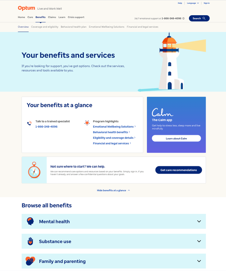
Get Care was the entry point for most members, but usability issues in Benefits Exploration and Onboarding created drop-off and confusion that surfaced in testing regardless of where sessions started. We made the case for treating liveandworkwell.com holistically — connected flows across all three breakpoints, not isolated screens.

KEY DECISIONS

A/B evidence

In a multi-designer environment with existing stakeholder attachment to the legacy experience, opinion wasn't enough. A/B testing created a shared empirical baseline. New design winning clearly on speed and errors gave the team conviction to move forward without prolonged debate.

RESULTS

USABILITY

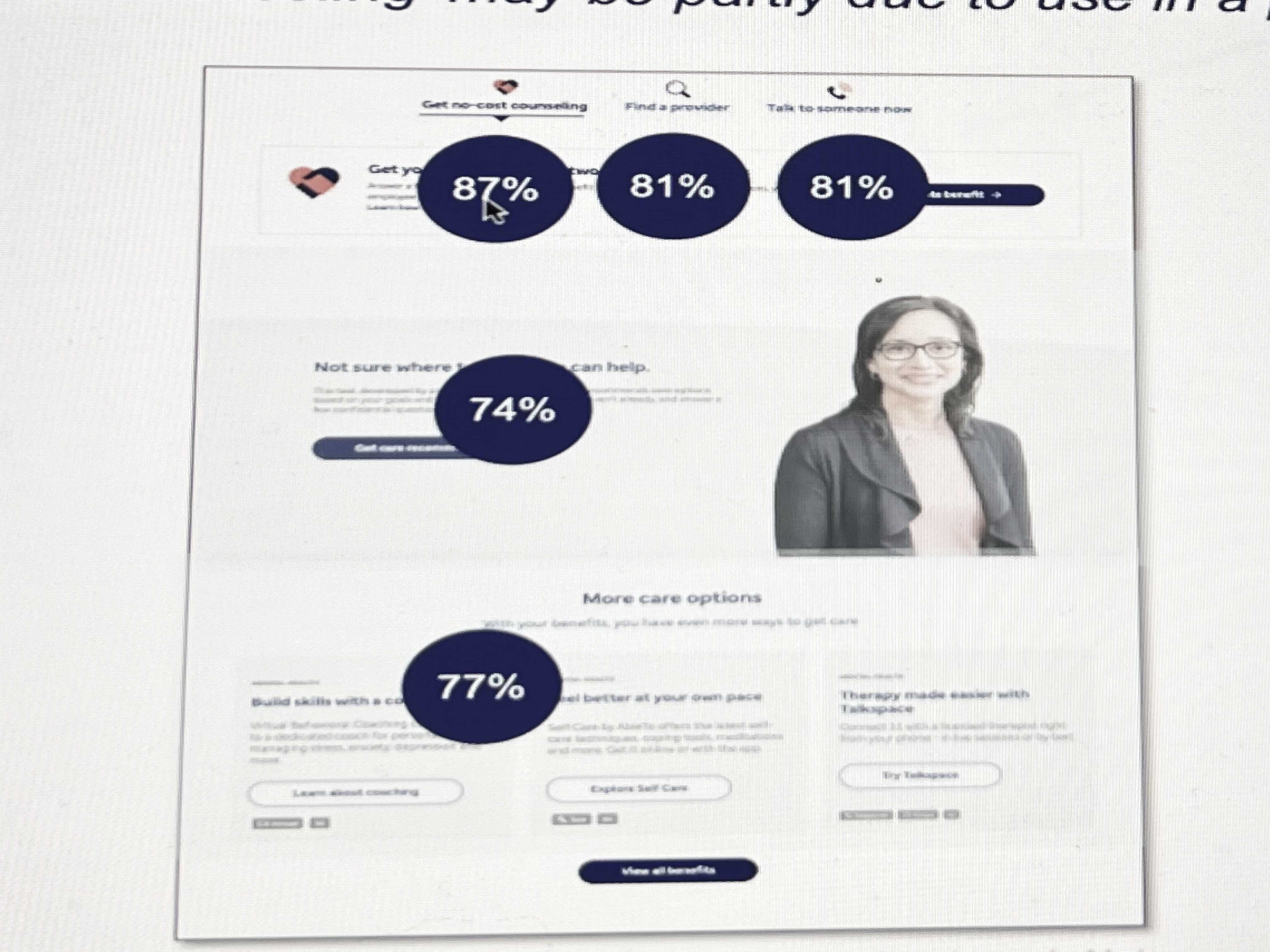
95%+ task completion across tested flows in usability rounds — including high-complexity scenarios in Benefits Exploration and Onboarding that had previously generated significant drop-off.

A/B TESTING

New designs outperformed legacy clearly on both speed and error rate. Gave the team and stakeholders a shared, defensible reason to move off the legacy experience.

NAVIGATION

Hierarchy testing confirmed the restructured IA surfaced critical items members previously couldn't find — first-click accuracy improved meaningfully on Get Care, Benefits Exploration, and key support entry points.

HANDOFF

Produced component documentation covering states, behaviors, and interactions — giving engineers a precise spec rather than leaving implementation details to interpretation.

LAUNCH

UAT completed before project end — issues caught and resolved before soft launch. Handed off a product that had been tested end-to-end by real users, not just internally validated.

RETROSPECTIVE

  • WHAT WORKED
  • Instructional content was dense and unstructured — members couldn't scan to find relevant guidance quickly
  • Navigation buried critical items — members couldn't locate Get Care or understand what benefits and programs were available without multi-step searching
  • Using A/B testing and hierarchy data together — behavioral evidence did more to align stakeholders than any design review would have.
  • WHAT I'D CHANGE
  • Coordinating across multiple designers required clearer ownership boundaries — scope overlaps slowed decisions on shared components mid-engagement.
  • Earlier Technical Validation - Some design ideas had to be simplified due to technical constraints discovered later in the process. I'd involve engineering earlier in the ideation phase to understand feasibility upfront.

TESTIMONIALS

  • Michael Phillips

    UX Writer / Content Strategist at Optum

    "Mara is a fantastic designer. I’m a content designer, UX writer, and Mara mega-fan. We worked together on multiple projects together at Optum from complex user flows with tricky stakeholder requirements to a redesign of our website’s main strategy and entry points. Mara was consistently curious, receptive, insightful, and productive. I would work with her again in a heartbeat."

    Matthew Cooper

    Product Manager at National Grid

    "I would definitely recommend Mara. I have worked with her at The Hartford, and while on the team with her, I observed that she has great design ideas, she is highly motivated and has a great attitude for pushing great design. She is approachable, asks the right questions to fully understand the assignment at hand, and is a great addition to the team."

  • Kate Hitchcock

    Senior UX Designer at Optum

    "Holy smokes, every now and then you come across a teammate who just blows expectations out of the water and DELIVERS! Mara is one such person. We brought Mara in to help deliver on a highly visible product with a seriously challenging timeline in complex space with an impact to millions of users. Mara showed a balance of curiosity, problem solving and tactical execution that outshines many people with more senior titles and I can truly say we could not have launched without her. Added to that, Mara is truly delightful human and partner to work with. I recommend her without hesitation."

    "Holy smokes, every now and then you come across a teammate who just blows expectations out of the water and DELIVERS! Mara is one such person. We brought Mara in to help deliver on a highly visible product with a seriously challenging timeline in complex space with an impact to millions of users. Mara showed a balance of curiosity, problem solving and tactical execution that outshines many people with more senior titles and I can truly say we could not have launched without her. Added to that, Mara is truly delightful human and partner to work with. I recommend her without hesitation."

Read Case Study - Internal Insurance App Redesign

Let’s work together.

I always look for more opportunities to collaborate, whether through a corporate role or by supporting my local community. If you're a local independent business owner seeking to transform your website or refresh your branding assets, reach out at marasuwannawat@gmail.com

Resume

Phone

Mara Suwannawat

is a product designer, based in Massachusetts, USA.

© 2026 All Rights Reserved

Case Study | Optum | 2023

Redesigned behavioral health platform across every screen size

How a cross-functional UX team restructured navigation, redesigned high-complexity flows, and produced atomic-level component documentation across desktop, tablet, and mobile — so members could find and use behavioral health care without friction, on any device.

Customer-facing redesign

End-to-end

IA Restructure

Healthcare / Behavioral

Responsive Design

Enterprise B2B

Component Documentation

Figma

95%

TASK COMPLETION

Across usability test rounds

A/B win

NEW VS. LEGACY

Faster + fewer errors

↑ First-click

IA ACCURACY

Critical items surfaced vs. buried

6 streams

SCOPE

Landing · Get Care · Benefits · Onboarding · Info · Handoff Docs

Cityscape

FRAMEWORK

My Role

UX Designer

Team

4 UX designers · 2 PMs · 3 content strategists · 1 accessibility specialist · dev team · behavioral health SMEs

Methods

A/B testing, first-click / last-click hierarchy testing, usability testing, user satisfaction surveys, UAT, soft launch

Users

Health plan members seeking behavioral health care — navigating benefits, providers, and available programs

Success Metrics

Task completion rate, navigation accuracy, user satisfaction, A/B test outcomes vs. legacy

Process Arc

Research → concept → pitch to business stakeholders → executive presentation → UAT → soft launch

Scope

Landing page, Get Care (provider search), Benefits Exploration, Onboarding & Eligibility, Instructional / Info pages, Navigation IA — designed across desktop, tablet, and mobile, with atomic-level component & behavior documentation for engineering handoff

DESIGN PROCESS

Double Diamond Framework

BEFORE → AFTER

  • Before
  • Instructional content was dense and unstructured — members couldn't scan to find relevant guidance quickly
  • Navigation buried critical items — members couldn't locate Get Care or understand what benefits and programs were available without multi-step searching
  • Onboarding lacked eligibility confirmation — members entered the site uncertain about what their plan covered
  • Benefits exploration was buried and hard to parse — members couldn't quickly understand what programs, tools, or services their plan included
  • Inconsistent UI components across flows created visual noise and raised cognitive load on already-stressed users
  • No shared design language — each flow felt like a separate product, eroding trust and learnability
  • Landing page didn't orient new members — no clear entry point for understanding what the site offered or how to start.
  • After
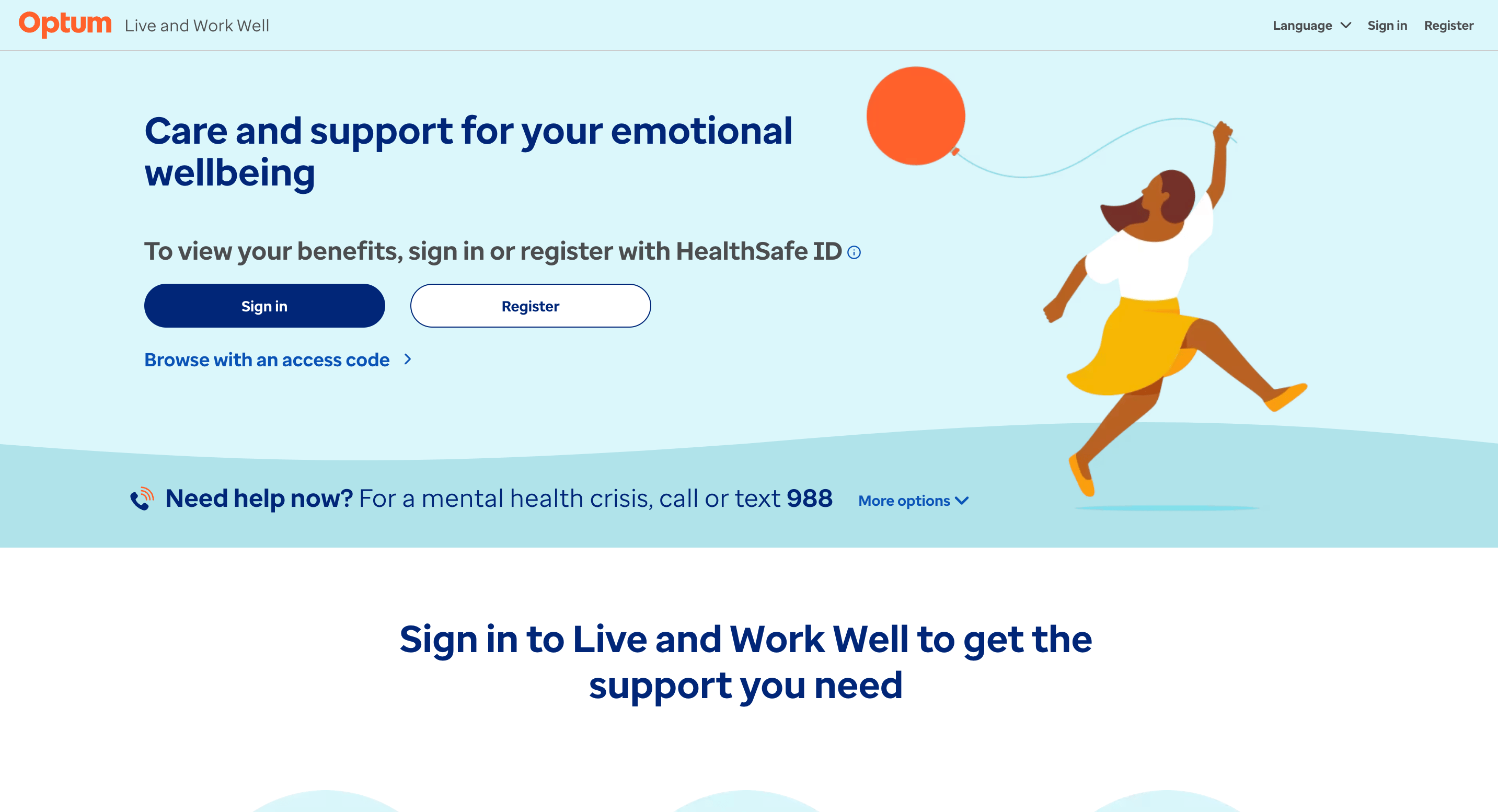
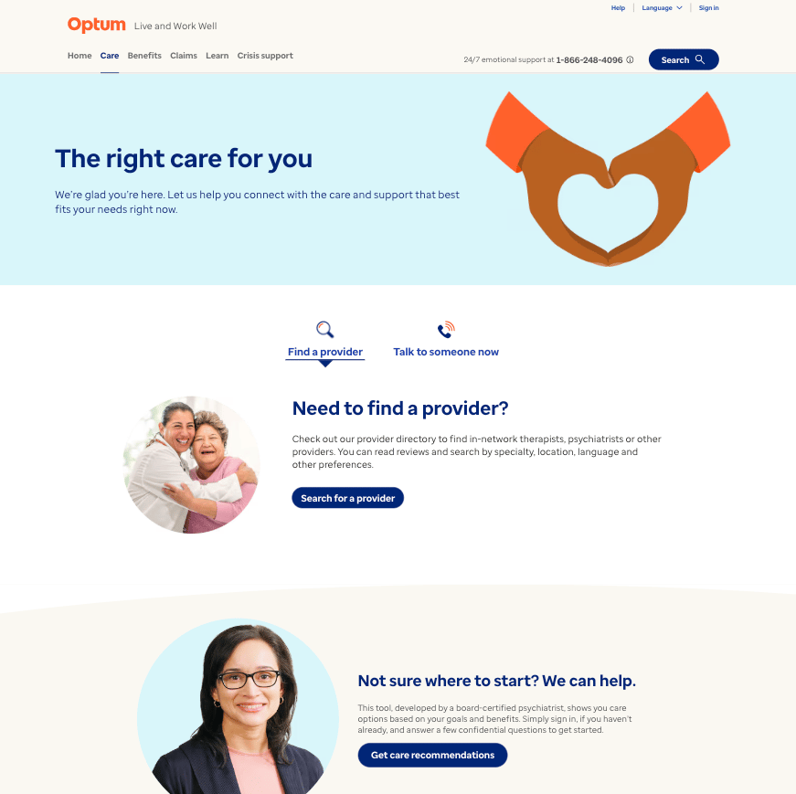
  • Redesigned landing page established a clear first impression and directed members toward the right starting point for their need.
  • Instructional pages restructured for scan ability — content hierarchy, chunking, and progressive disclosure reduced cognitive load.
  • Restructured IA surfaced the most-needed items at the top level — first-click accuracy validated in hierarchy testing.
  • Onboarding flow confirmed eligibility inline, setting clear expectations before members navigated deeper into the site.
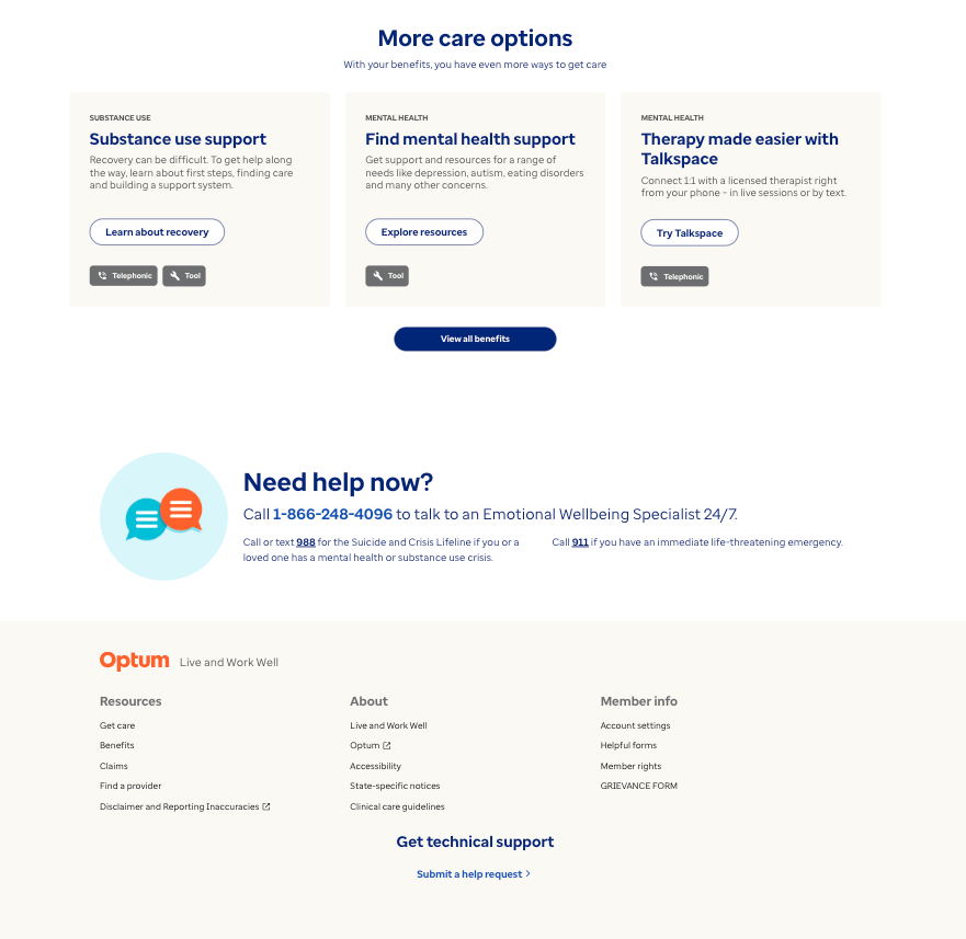
  • Benefits exploration redesigned with clear hierarchy — members could quickly identify programs, tools, and services relevant to their needs.
  • Unified component library established consistent patterns across all four work streams.
  • New design outperformed legacy in A/B testing on speed, error rate, and user satisfaction across tested flows.

CONSTRAINTS

RESPONSIVE

Every flow required full design coverage across desktop, tablet, and mobile breakpoints — navigation patterns, component behavior, and layout hierarchy had to hold up at all three sizes, not just desktop-first.

ORG

Behavioral health is a regulated, sensitive domain. Every content and UX decision touching clinical language, eligibility, or benefits required stakeholder alignment across compliance, clinical, and product — slowing iteration cycles.

TECH

The legacy site had deep technical debt and fragmented component patterns. New designs had to account for existing system constraints while establishing consistency — rebuilding from scratch wasn't an option.

ACCESS

Recruiting behavioral health members for usability testing required careful protocols — HIPAA compliance and participant sensitivity limited session formats and recruitment channels.

SCOPE

Working across five parallel streams (Landing, Get Care, Benefits Exploration, Onboarding, Info pages) meant prioritization was constant — high-complexity flows required focused depth while the IA and handoff documentation work needed to stay in sync across all streams.

TIME

As one of several designers on a large engagement, design decisions needed to be defensible quickly — A/B tests and hierarchy data had to do the persuasive heavy lifting in cross-team reviews.

KEY DECISIONS

Restructure the IA

Hierarchy testing showed members consistently failed to locate critical items under the existing structure. First-click data made it clear patching labels wasn't enough. We restructured the top-level IA around member goals (Find Care, Explore Benefits, Get Support) rather than system categories.

KEY DECISIONS

Two-stage pitch

Pitched design concepts first to business stakeholders to pressure-test feasibility and business alignment, then refined before presenting to executives. The design rationale was battle-tested before it reached the room where decisions got made.

KEY DECISIONS

The Care Journey

Get Care was the entry point for most members, but usability issues in Benefits Exploration and Onboarding created drop-off and confusion that surfaced in testing regardless of where sessions started. We made the case for treating liveandworkwell.com holistically — connected flows across all three breakpoints, not isolated screens.

KEY DECISIONS

A/B evidence

In a multi-designer environment with existing stakeholder attachment to the legacy experience, opinion wasn't enough. A/B testing created a shared empirical baseline. New design winning clearly on speed and errors gave the team conviction to move forward without prolonged debate.

RESULTS

Usability

95%+ task completion across tested flows in usability rounds — including high-complexity scenarios in Benefits Exploration and Onboarding that had previously generated significant drop-off.

A/B Testing

New designs outperformed legacy clearly on both speed and error rate. Gave the team and stakeholders a shared, defensible reason to move off the legacy experience.

Methods

A/B testing, first-click / last-click hierarchy testing, usability testing, user satisfaction surveys, UAT, soft launch

Users

Health plan members seeking behavioral health care — navigating benefits, providers, and available programs

Handoff

Produced component documentation covering states, behaviors, and interactions — giving engineers a precise spec rather than leaving implementation details to interpretation.

Scope

Landing page, Get Care (provider search), Benefits Exploration, Onboarding & Eligibility, Instructional / Info pages, Navigation IA — designed across desktop, tablet, and mobile, with atomic-level component & behavior documentation for engineering handoff

RETROSPECTIVE

  • WHAT WORKED
  • Instructional content was dense and unstructured — members couldn't scan to find relevant guidance quickly
  • Navigation buried critical items — members couldn't locate Get Care or understand what benefits and programs were available without multi-step searching
  • Using A/B testing and hierarchy data together — behavioral evidence did more to align stakeholders than any design review would have.
  • WHAT I'D CHANGE
  • Coordinating across multiple designers required clearer ownership boundaries — scope overlaps slowed decisions on shared components mid-engagement.
  • Earlier Technical Validation - Some design ideas had to be simplified due to technical constraints discovered later in the process. I'd involve engineering earlier in the ideation phase to understand feasibility upfront.

TESTIMONIALS

  • Michael Phillips

    UX Writer / Content Strategist at Optum

    "Mara is a fantastic designer. I’m a content designer, UX writer, and Mara mega-fan. We worked together on multiple projects together at Optum from complex user flows with tricky stakeholder requirements to a redesign of our website’s main strategy and entry points. Mara was consistently curious, receptive, insightful, and productive. I would work with her again in a heartbeat."

    Matthew Cooper

    Product Manager at National Grid

    "I would definitely recommend Mara. I have worked with her at The Hartford, and while on the team with her, I observed that she has great design ideas, she is highly motivated and has a great attitude for pushing great design. She is approachable, asks the right questions to fully understand the assignment at hand, and is a great addition to the team."

  • Kate Hitchcock

    Senior UX Designer at Optum

    "Holy smokes, every now and then you come across a teammate who just blows expectations out of the water and DELIVERS! Mara is one such person. We brought Mara in to help deliver on a highly visible product with a seriously challenging timeline in complex space with an impact to millions of users. Mara showed a balance of curiosity, problem solving and tactical execution that outshines many people with more senior titles and I can truly say we could not have launched without her. Added to that, Mara is truly delightful human and partner to work with. I recommend her without hesitation."

    "Holy smokes, every now and then you come across a teammate who just blows expectations out of the water and DELIVERS! Mara is one such person. We brought Mara in to help deliver on a highly visible product with a seriously challenging timeline in complex space with an impact to millions of users. Mara showed a balance of curiosity, problem solving and tactical execution that outshines many people with more senior titles and I can truly say we could not have launched without her. Added to that, Mara is truly delightful human and partner to work with. I recommend her without hesitation."

Work

About

Read Case Study - Internal Insurance App Redesign

Let’s work together.

I always look for more opportunities to collaborate, whether through a corporate role or by supporting my local community. If you're a local independent business owner seeking to transform your website or refresh your branding assets, reach out at marasuwannawat@gmail.com

Mara Suwannawat

is a product designer, based in Massachusetts, USA.

Resume

Phone

© 2026 All Rights Reserved

Work

About

Case Study | Optum | 2023

Redesigned behavioral health platform across every screen size

How a cross-functional UX team restructured navigation, redesigned high-complexity flows, and produced atomic-level component documentation across desktop, tablet, and mobile — so members could find and use behavioral health care without friction, on any device.

Customer-facing redesign

End-to-end

IA Restructure

Healthcare / Behavioral

Responsive Design

Enterprise B2B

Component Documentation

Figma

95%

TASK COMPLETION

Across usability test rounds

A/B win

NEW VS. LEGACY

Faster + fewer errors

↑ First-click

IA ACCURACY

Critical items surfaced vs. buried

6 streams

SCOPE

Landing · Get Care · Benefits · Onboarding · Info · Handoff Docs

Cityscape

FRAMEWORK

My Role

UX Designer

Team

4 UX designers · 2 PMs · 3 content strategists · 1 accessibility specialist · dev team · behavioral health SMEs

Methods

A/B testing, first-click / last-click hierarchy testing, usability testing, user satisfaction surveys, UAT, soft launch

Users

Health plan members seeking behavioral health care — navigating benefits, providers, and available programs

Success Metrics

Task completion rate, navigation accuracy, user satisfaction, A/B test outcomes vs. legacy

Scope

Landing page, Get Care (provider search), Benefits Exploration, Onboarding & Eligibility, Instructional / Info pages, Navigation IA — designed across desktop, tablet, and mobile, with atomic-level component & behavior documentation for engineering handoff

Process Arc

Research → concept → pitch to business stakeholders → executive presentation → UAT → soft launch

DESIGN PROCESS

Double Diamond Framework

BEFORE → AFTER

  • Before
  • Landing page didn't orient new members — no clear entry point for understanding what the site offered or how to start.
  • Instructional content was dense and unstructured — members couldn't scan to find relevant guidance quickly.
  • Navigation buried critical items — members couldn't locate Get Care or understand what benefits and programs were available without multi-step searching.
  • Onboarding lacked eligibility confirmation — members entered the site uncertain about what their plan covered.
  • Benefits exploration was buried and hard to parse — members couldn't quickly understand what programs, tools, or services their plan included.
  • Inconsistent UI components across flows created visual noise and raised cognitive load on already-stressed users.
  • No shared design language — each flow felt like a separate product, eroding trust and learnability.
  • After
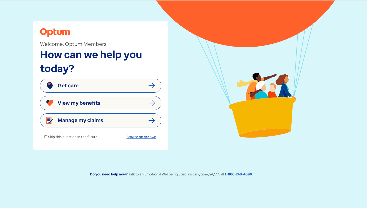
  • Redesigned landing page established a clear first impression and directed members toward the right starting point for their need.
  • Instructional pages restructured for scan ability — content hierarchy, chunking, and progressive disclosure reduced cognitive load.
  • Restructured IA surfaced the most-needed items at the top level — first-click accuracy validated in hierarchy testing.
  • Onboarding flow confirmed eligibility inline, setting clear expectations before members navigated deeper into the site.
  • Benefits exploration redesigned with clear hierarchy — members could quickly identify programs, tools, and services relevant to their needs.
  • Unified component library established consistent patterns across all four work streams.
  • New design outperformed legacy in A/B testing on speed, error rate, and user satisfaction across tested flows.

CONSTRAINTS

RESPONSIVE

Every flow required full design coverage across desktop, tablet, and mobile breakpoints — navigation patterns, component behavior, and layout hierarchy had to hold up at all three sizes, not just desktop-first.

ORG

Behavioral health is a regulated, sensitive domain. Every content and UX decision touching clinical language, eligibility, or benefits required stakeholder alignment across compliance, clinical, and product — slowing iteration cycles.

TECH

The legacy site had deep technical debt and fragmented component patterns. New designs had to account for existing system constraints while establishing consistency — rebuilding from scratch wasn't an option.

SCOPE

Working across five parallel streams (Landing, Get Care, Benefits Exploration, Onboarding, Info pages) meant prioritization was constant — high-complexity flows required focused depth while the IA and handoff documentation work needed to stay in sync across all streams.

ACCESS

Recruiting behavioral health members for usability testing required careful protocols — HIPAA compliance and participant sensitivity limited session formats and recruitment channels.

TIME

As one of several designers on a large engagement, design decisions needed to be defensible quickly — A/B tests and hierarchy data had to do the persuasive heavy lifting in cross-team reviews.

KEY DECISIONS

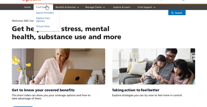
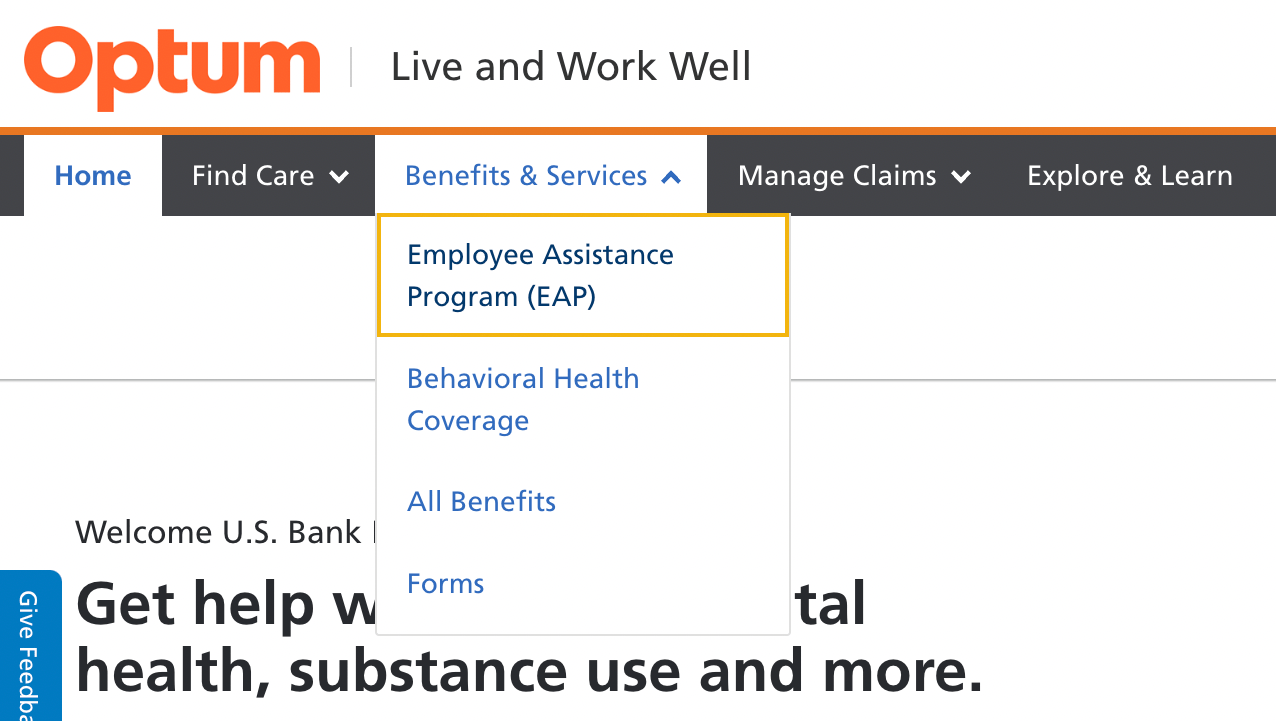
Restructure the IA

Hierarchy testing showed members consistently failed to locate critical items under the existing structure. First-click data made it clear patching labels wasn't enough. We restructured the top-level IA around member goals (Find Care, Explore Benefits, Get Support) rather than system categories.
KEY DECISIONS

Two-stage pitch

Pitched design concepts first to business stakeholders to pressure-test feasibility and business alignment, then refined before presenting to executives. The design rationale was battle-tested before it reached the room where decisions got made.
KEY DECISIONS

The Care Journey

Get Care was the entry point for most members, but usability issues in Benefits Exploration and Onboarding created drop-off and confusion that surfaced in testing regardless of where sessions started. We made the case for treating liveandworkwell.com holistically — connected flows across all three breakpoints, not isolated screens.

KEY DECISIONS

A/B evidence

In a multi-designer environment with existing stakeholder attachment to the legacy experience, opinion wasn't enough. A/B testing created a shared empirical baseline. New design winning clearly on speed and errors gave the team conviction to move forward without prolonged debate.

RESULTS

USABILITY

95%+ task completion across tested flows in usability rounds — including high-complexity scenarios in Benefits Exploration and Onboarding that had previously generated significant drop-off.

A/B TESTING

New designs outperformed legacy clearly on both speed and error rate. Gave the team and stakeholders a shared, defensible reason to move off the legacy experience.

NAVIGATION

Hierarchy testing confirmed the restructured IA surfaced critical items members previously couldn't find — first-click accuracy improved meaningfully on Get Care, Benefits Exploration, and key support entry points.

HANDOFF

Produced component documentation covering states, behaviors, and interactions — giving engineers a precise spec rather than leaving implementation details to interpretation.

LAUNCH

UAT completed before project end — issues caught and resolved before soft launch. Handed off a product that had been tested end-to-end by real users, not just internally validated.

RETROSPECTIVE

  • WHAT WORKED
  • Using A/B testing and hierarchy data together — behavioral evidence did more to align stakeholders than any design review would have.
  • Framing the work around the full member journey, not individual flows, exposed upstream problems that isolated Get Care testing would have missed.
  • Atomic-level component documentation at handoff — specifying behavioral states, not just visuals, meant engineers had less to interpret and fewer back-and-forth clarifications mid-build.
  • WHAT I'D CHANGE
  • Coordinating across multiple designers required clearer ownership boundaries — scope overlaps slowed decisions on shared components mid-engagement.
  • Earlier Technical Validation - Some design ideas had to be simplified due to technical constraints discovered later in the process. I'd involve engineering earlier in the ideation phase to understand feasibility upfront.

TESTIMONIALS

  • Michael Phillips

    UX Writer / Content Strategist at Optum

    "Mara is a fantastic designer. I’m a content designer, UX writer, and Mara mega-fan. We worked together on multiple projects together at Optum from complex user flows with tricky stakeholder requirements to a redesign of our website’s main strategy and entry points. Mara was consistently curious, receptive, insightful, and productive. I would work with her again in a heartbeat."

    Matthew Cooper

    Product Manager at National Grid

    "I would definitely recommend Mara. I have worked with her at The Hartford, and while on the team with her, I observed that she has great design ideas, she is highly motivated and has a great attitude for pushing great design. She is approachable, asks the right questions to fully understand the assignment at hand, and is a great addition to the team."

  • Kate Hitchcock

    Senior UX Designer at Optum

    "Holy smokes, every now and then you come across a teammate who just blows expectations out of the water and DELIVERS! Mara is one such person. We brought Mara in to help deliver on a highly visible product with a seriously challenging timeline in complex space with an impact to millions of users. Mara showed a balance of curiosity, problem solving and tactical execution that outshines many people with more senior titles and I can truly say we could not have launched without her. Added to that, Mara is truly delightful human and partner to work with. I recommend her without hesitation."

    "Holy smokes, every now and then you come across a teammate who just blows expectations out of the water and DELIVERS! Mara is one such person. We brought Mara in to help deliver on a highly visible product with a seriously challenging timeline in complex space with an impact to millions of users. Mara showed a balance of curiosity, problem solving and tactical execution that outshines many people with more senior titles and I can truly say we could not have launched without her. Added to that, Mara is truly delightful human and partner to work with. I recommend her without hesitation."

Read Case Study - Internal Insurance App Redesign

Let’s work together.

I always look for more opportunities to collaborate, whether through a corporate role or by supporting my local community. If you're a local independent business owner seeking to transform your website or refresh your branding assets, reach out at marasuwannawat@gmail.com

Mara Suwannawat

is a product designer, based in Massachusetts, USA.

Resume

Phone

© 2026 All Rights Reserved