Work

About

Mara Suwannawat

Open mobile menu

Benefits

Specifications

How-to

Contact Us

Learn More

Phone

Case Study | Johnson & Johnson Innovative Medicine | 2024

Transformed

1,000+ pharmaceutical documents into an intuitive digital experience

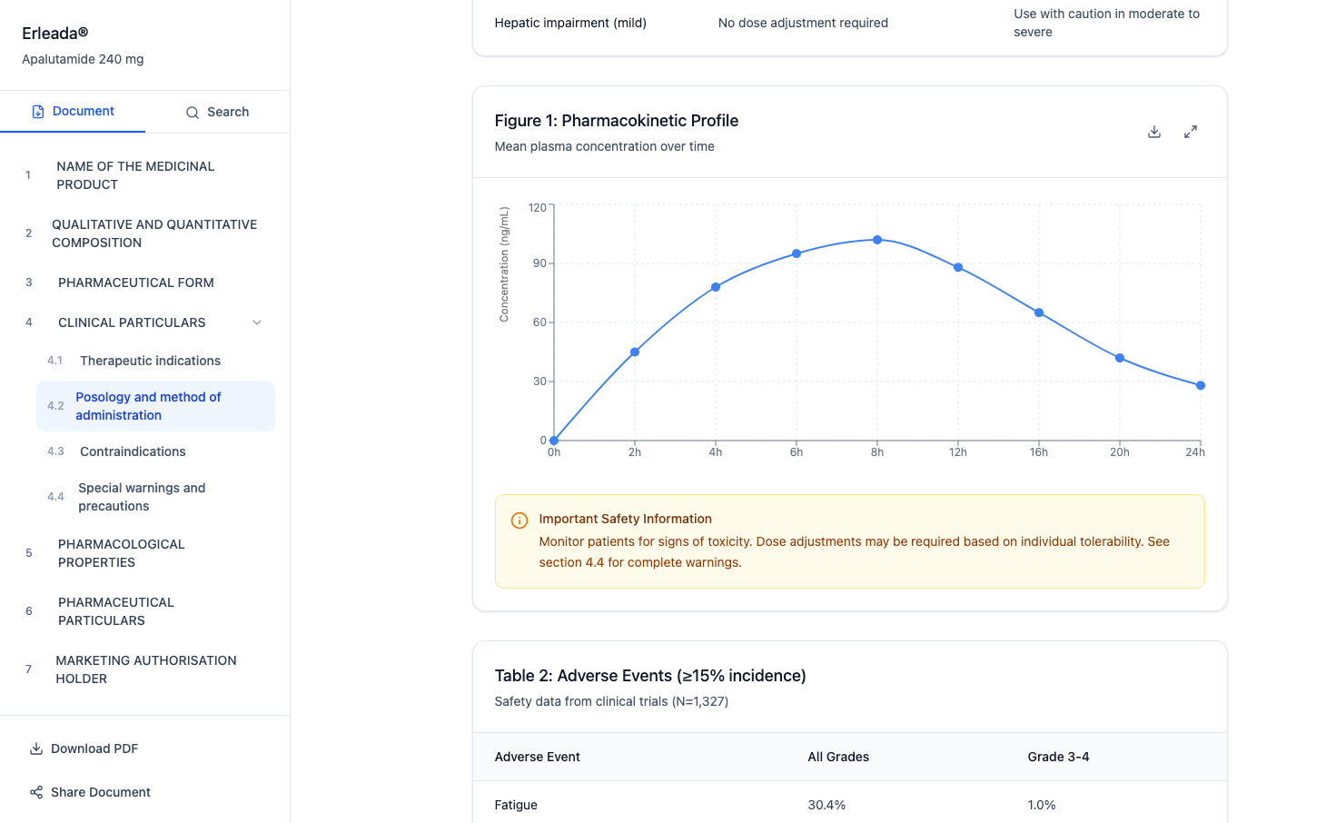
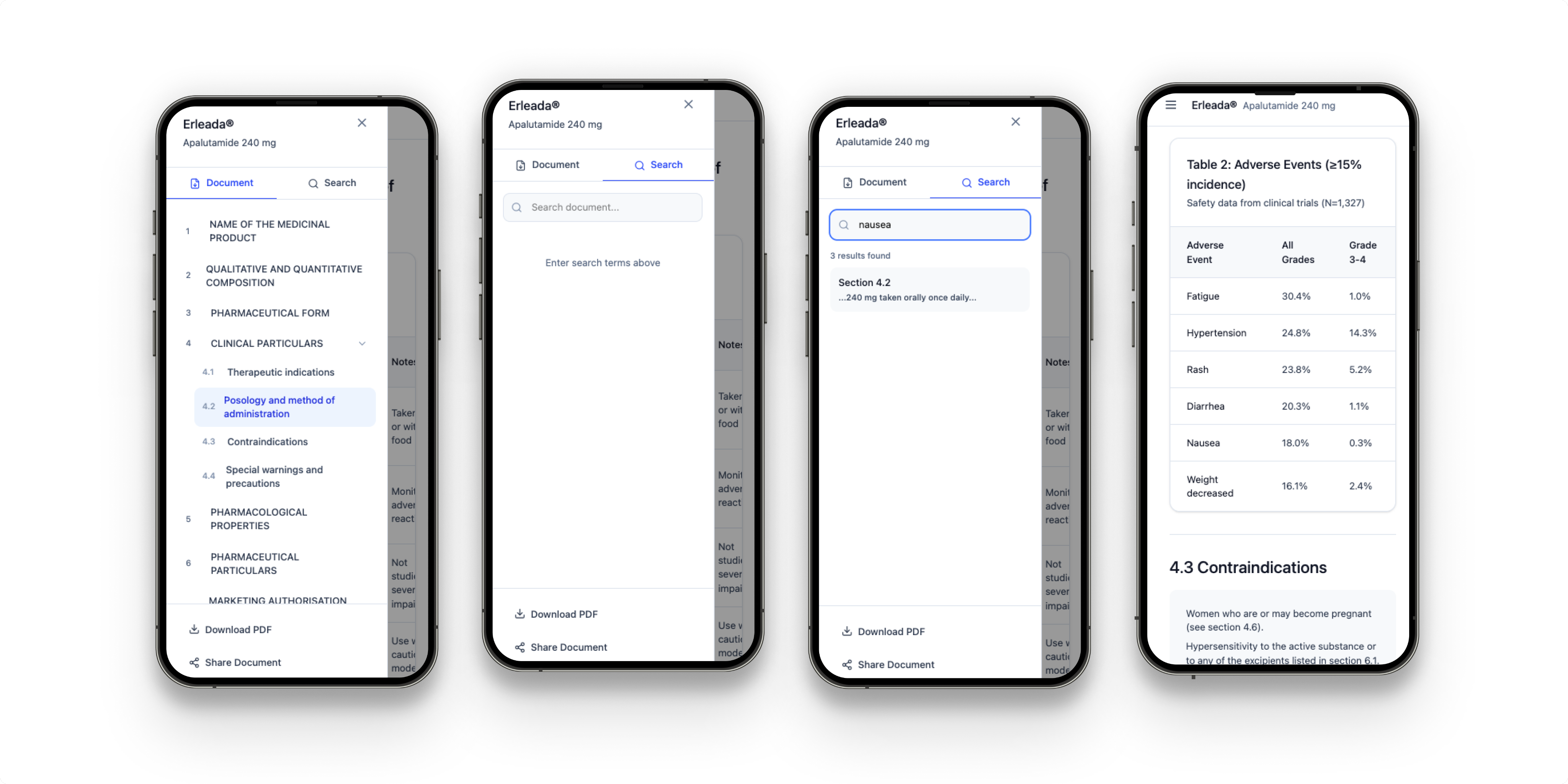
How partnering with a PM to establish UX from scratch, I designed and validated a proof-of-concept dual-audience medical information application — transforming static PDF downloads into a searchable, filterable app embedded across J&J sites for patients and HCPs — in 4 months, in time for an executive-level demo.

MVP Proof of Concept

Pharma / MedTech

Dual Audience

Usability Testing

Figma

Responsive Design

Engineers Collaboration

100%

TASK COMPLETION

Across all usability test sessions

Demo Delivered

POC TIMELINE

Discovery through exec-ready demo

2 audiences

USER TYPES

Patients + HCPs — same UI, distinct content

Day 1

ENG PARTNERSHIP

Design & build ran in parallel
Cityscape

FRAMEWORK

My Role

UX Designer — first UX investment on this product

Team

1 UX Designer (me) · 1 strategist / PM · engineering team · J&J medical and regulatory SMEs

Methods

User research, usability testing, rapid prototyping, iterative design-build collaboration with engineering

Users

Patients seeking medication information · Healthcare providers (HCPs) needing full clinical / scientific data

Success Metrics

100% task completion in usability testing · stakeholder-ready demo validated for executive presentation

Process Arc

Research → UX process setup → concept → design-build iteration → usability testing → POC demo → executive presentation

DESIGN PROCESS

My strategic approach
BEFORE → AFTER

  • Before

    View ‘After’

  • Medical information existed only as static PDF downloads — patients and HCPs had to locate, download, and manually search through documents to find what they needed
  • No search or filter capability — finding a specific medication, indication, or clinical detail meant scrolling through unstructured document content
  • No UX process existed — MVP level without research, testing, or a shared framework
  • No application to bridge patients and HCPs — two very different information needs with no unified access point across J&J sites
  • Patients and HCPs had to navigate to separate, disconnected resources to find medication or clinical information
  • No validated concept to present to executives — the product existed only as an idea without evidence it would work for users
  • Backend Issue - the engineering team figured out how to pull information from multiple databases and present it in a single interface with a CMS structure.

CONSTRAINTS

CMS FORMAT

We couldn't reorganize the database content because the existing information was stored in static PDFs within CMS formats — well-established formats that medical, legal, and regulatory teams were familiar with and had approved. I needed to develop a solution that met business and user needs. 

REGULATORY

Pharmaceutical content is tightly regulated. Every piece of information surfaced to patients vs. HCPs had to be medically and legally appropriate for that audience — copy, hierarchy, and content access required SME and compliance sign-off.

DUAL AUDIENCE

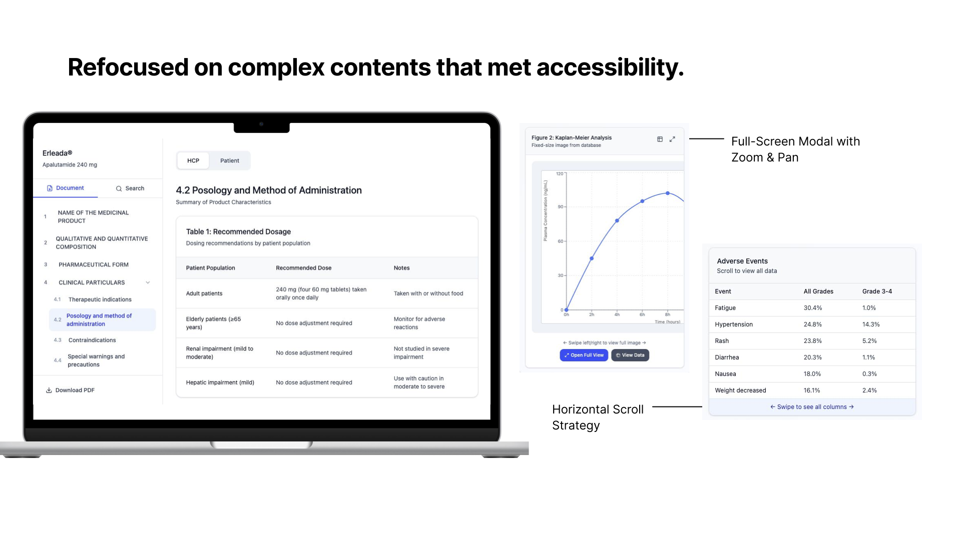
Designing one interface that works for two fundamentally different user types — patients who need simple, digestible leaflet information and HCPs who need full clinical and scientific depth — without making either experience feel like a compromise.

SCOPE

The application had to embed cleanly into existing J&J site infrastructure. Design decisions had to account for technical feasibility in real time — which made day-one engineering partnership non-negotiable.

TIME

Four months to develop an executive-ready demo from scratch — without any prior user experience process, existing design artifacts, or established research routines. 

KEY DECISIONS

App over PDF

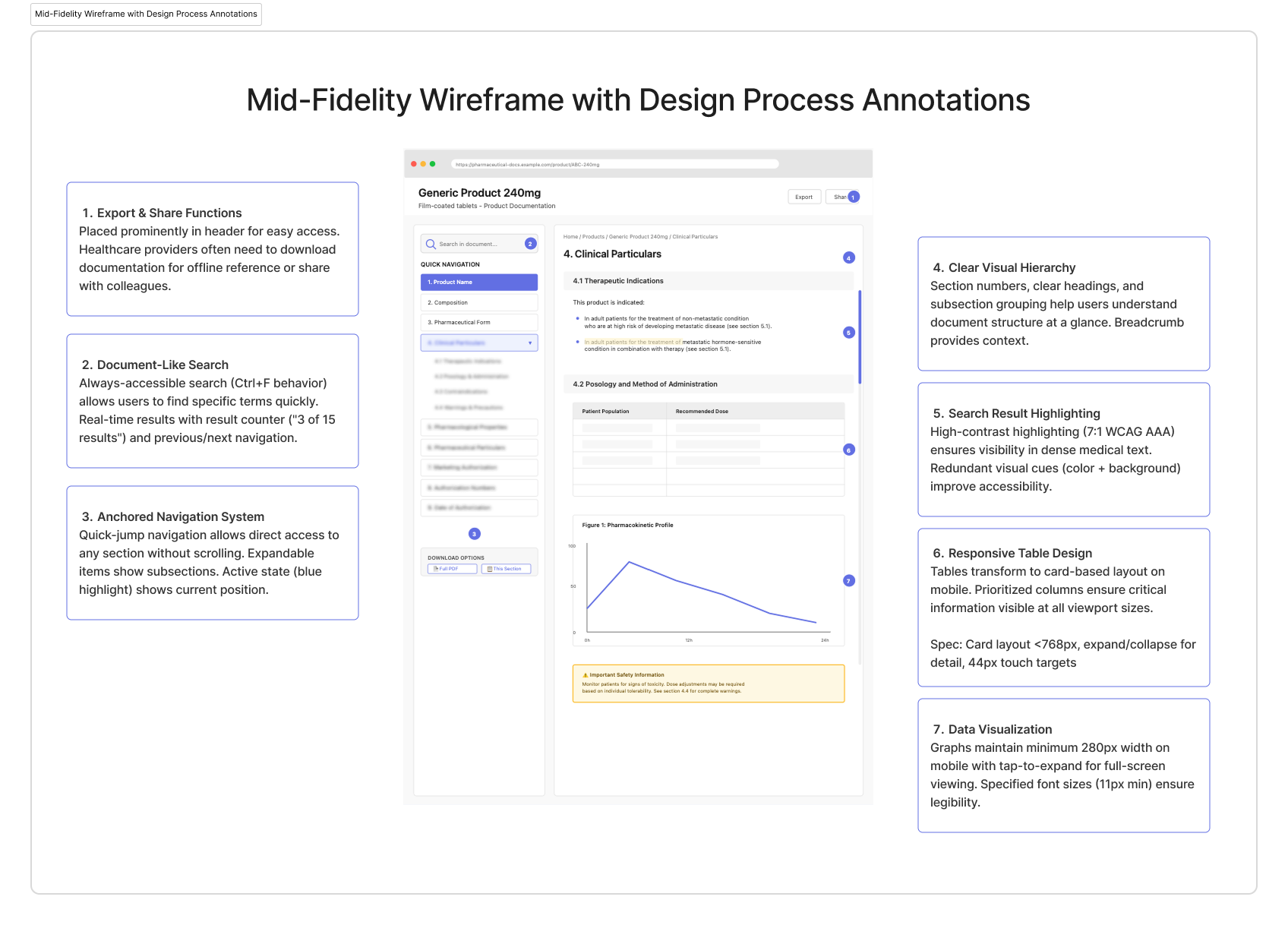
The case for the transformation had to be explicit. PDFs required download, offered no search, no filtering, and no role-based content — a patient and an HCP received the same undifferentiated document. The app gave both audiences instant access within the J&J site ecosystem, keyword search and category filtering to find information in seconds, and content tailored to their role. The usability test results — 100% task completion — became the evidence that the format change was the right call, not just a technology preference.
KEY DECISIONS

Single UI, role-based content

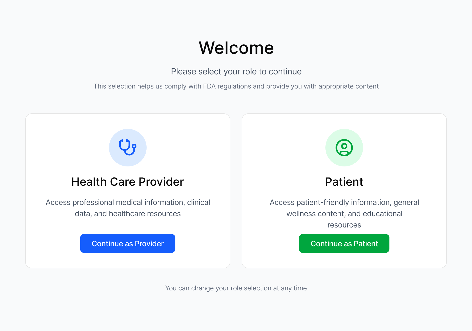
Building two separate apps would have doubled the scope and blown the 4-month timeline. Instead, we designed a single experience with role-based content — same structure and navigation, but patients see patient leaflet information and HCPs see full scientific data. Validated in usability testing with both groups.

KEY DECISIONS

A collaborative effort from the very beginning of the project.

With no prior UX investment, the temptation was to jump straight to screens. Instead, I partnered with the Project Manager to set up a lightweight research and testing process first — even a minimal framework prevented the kind of rework that kills POC timelines. Research and design ran in tight, and fast loops.

Engineering was looped in from day one — design and build iterated together, which surfaced technical constraints early and meant the demo was a real working prototype, not just a Figma walkthrough.

KEY DECISIONS

Evidence-led demo

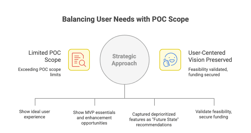
The MVP proof-of-concept needed to do two things at once: demonstrate the concept works for users and give executives confidence to fund the next phase. Usability test results showing 100% task completion became the core of the stakeholder narrative.

RESULTS

User Impact

100% task completion - Core workflows were learnable without training, validated fundamental interaction design. Proxy user testing confirmed navigation patterns and information architecture were intuitive.

Delivered Business Outcomes

Design work provided stakeholders with compelling demos and materials to present to larger leadership groups for funding approval. I delivered on the goal of this project, which was to design and deliver a demo product that works at the MVP level and beyond.

Proved Technical Feasibility

Real-time database integration and multi-database architecture validated the concept was buildable. Concept proved within 4 months - built in close collaboration with engineering from day one.

Strong Usability Metrics

SUS score of 82/100 and 4.2/5 satisfaction indicated solid foundation for further development.

RETROSPECTIVE

  • WHAT WORKED
  • Engineering from day one—streamlining the design-build process was the main reason the POC met the schedule without compromising quality.
  • Designing the complete vision and working with stakeholders to distinguish what proves the concept from what gets roadmapped. It's understanding that a focused POC enables future investment.
  • WHAT I'D CHANGE
  • I would have pushed for more usability test sessions across a wider range of HCP specialties — the participant pool was limited by timeline and access, and broader coverage would have strengthened the evidence.
  • Accessibility at Each Phase - Some improvements (like search highlight contrast) required late-stage rework. WCAG compliance checks should happen at each design phase, not primarily during testing.

TESTIMONIALS

  • Michael Phillips

    UX Writer / Content Strategist at Optum

    "Mara is a fantastic designer. I’m a content designer, UX writer, and Mara mega-fan. We worked together on multiple projects together at Optum from complex user flows with tricky stakeholder requirements to a redesign of our website’s main strategy and entry points. Mara was consistently curious, receptive, insightful, and productive. I would work with her again in a heartbeat."

    Matthew Cooper

    Product Manager at National Grid

    "I would definitely recommend Mara. I have worked with her at The Hartford, and while on the team with her, I observed that she has great design ideas, she is highly motivated and has a great attitude for pushing great design. She is approachable, asks the right questions to fully understand the assignment at hand, and is a great addition to the team."

  • Kate Hitchcock

    Senior UX Designer at Optum

    "Holy smokes, every now and then you come across a teammate who just blows expectations out of the water and DELIVERS! Mara is one such person. We brought Mara in to help deliver on a highly visible product with a seriously challenging timeline in complex space with an impact to millions of users. Mara showed a balance of curiosity, problem solving and tactical execution that outshines many people with more senior titles and I can truly say we could not have launched without her. Added to that, Mara is truly delightful human and partner to work with. I recommend her without hesitation."

    "Holy smokes, every now and then you come across a teammate who just blows expectations out of the water and DELIVERS! Mara is one such person. We brought Mara in to help deliver on a highly visible product with a seriously challenging timeline in complex space with an impact to millions of users. Mara showed a balance of curiosity, problem solving and tactical execution that outshines many people with more senior titles and I can truly say we could not have launched without her. Added to that, Mara is truly delightful human and partner to work with. I recommend her without hesitation."

Read Case Study - Behavioral Health Platform Redesign

Let’s work together.

I always look for more opportunities to collaborate, whether through a corporate role or by supporting my local community. If you're a local independent business owner seeking to transform your website or refresh your branding assets, reach out at marasuwannawat@gmail.com

Resume

Phone

Mara Suwannawat

is a product designer, based in Massachusetts, USA.

© 2026 All Rights Reserved

Work

About

Case Study | Johnson & Johnson Innovative Medicine | 2024

Transformed

1,000+ pharmaceutical documents into an intuitive digital experience

How partnering with a PM to establish UX from scratch, I designed and validated a proof-of-concept dual-audience medical information application — transforming static PDF downloads into a searchable, filterable app embedded across J&J sites for patients and HCPs — in 4 months, in time for an executive-level demo.

MVP Proof of Concept

Pharma / MedTech

Dual Audience

Usability Testing

Responsive Design

Engineers Collaboration

Figma

100%

TASK COMPLETION

Across all usability test sessions

Demo Delivered

POC TIMELINE

Discovery through exec-ready demo

2 audiences

USER TYPES

Patients + HCPs — same UI, distinct content

Day 1

ENG PARTNERSHIP

Design & build ran in parallel

Cityscape

FRAMEWORK

My Role

UX Designer — first UX investment on this product

Team

1 UX Designer (me) · 1 strategist / PM · engineering team · J&J medical and regulatory SMEs

Methods

User research, usability testing, rapid prototyping, iterative design-build collaboration with engineering

Users

Patients seeking medication information · Healthcare providers (HCPs) needing full clinical / scientific data

Success Metrics

100% task completion in usability testing · stakeholder-ready demo validated for executive presentation

Process Arc

Research → UX process setup → concept → design-build iteration → usability testing → POC demo → executive presentation

DESIGN PROCESS

My strategic approach

BEFORE → AFTER

  • Before

    View ‘After’

  • Medical information existed only as static PDF downloads — patients and HCPs had to locate, download, and manually search through documents to find what they needed
  • No search or filter capability — finding a specific medication, indication, or clinical detail meant scrolling through unstructured document content
  • No UX process existed — MVP level without research, testing, or a shared framework
  • No application to bridge patients and HCPs — two very different information needs with no unified access point across J&J sites
  • Patients and HCPs had to navigate to separate, disconnected resources to find medication or clinical information
  • No validated concept to present to executives — the product existed only as an idea without evidence it would work for users
  • Backend Issue - the engineering team figured out how to pull information from multiple databases and present it in a single interface with a CMS structure.

CONSTRAINTS

CMS FORMAT

We couldn't reorganize the database content because the existing information was stored in static PDFs within CMS formats — well-established formats that medical, legal, and regulatory teams were familiar with and had approved. I needed to develop a solution that met business and user needs. 

REGULATORY

Pharmaceutical content is tightly regulated. Every piece of information surfaced to patients vs. HCPs had to be medically and legally appropriate for that audience — copy, hierarchy, and content access required SME and compliance sign-off.

DUAL AUDIENCE

Designing one interface that works for two fundamentally different user types — patients who need simple, digestible leaflet information and HCPs who need full clinical and scientific depth — without making either experience feel like a compromise.

SCOPE

The application had to embed cleanly into existing J&J site infrastructure. Design decisions had to account for technical feasibility in real time — which made day-one engineering partnership non-negotiable.

TIME

Four months to develop an executive-ready demo from scratch — without any prior user experience process, existing design artifacts, or established research routines. 

KEY DECISIONS

App over PDF

The case for the transformation had to be explicit. PDFs required download, offered no search, no filtering, and no role-based content — a patient and an HCP received the same undifferentiated document. The app gave both audiences instant access within the J&J site ecosystem, keyword search and category filtering to find information in seconds, and content tailored to their role. The usability test results — 100% task completion — became the evidence that the format change was the right call, not just a technology preference.

KEY DECISIONS

Single UI, role-based content

Building two separate apps would have doubled the scope and blown the 4-month timeline. Instead, we designed a single experience with role-based content — same structure and navigation, but patients see patient leaflet information and HCPs see full scientific data. Validated in usability testing with both groups.
KEY DECISIONS

A collaborative effort from the very beginning of the project.

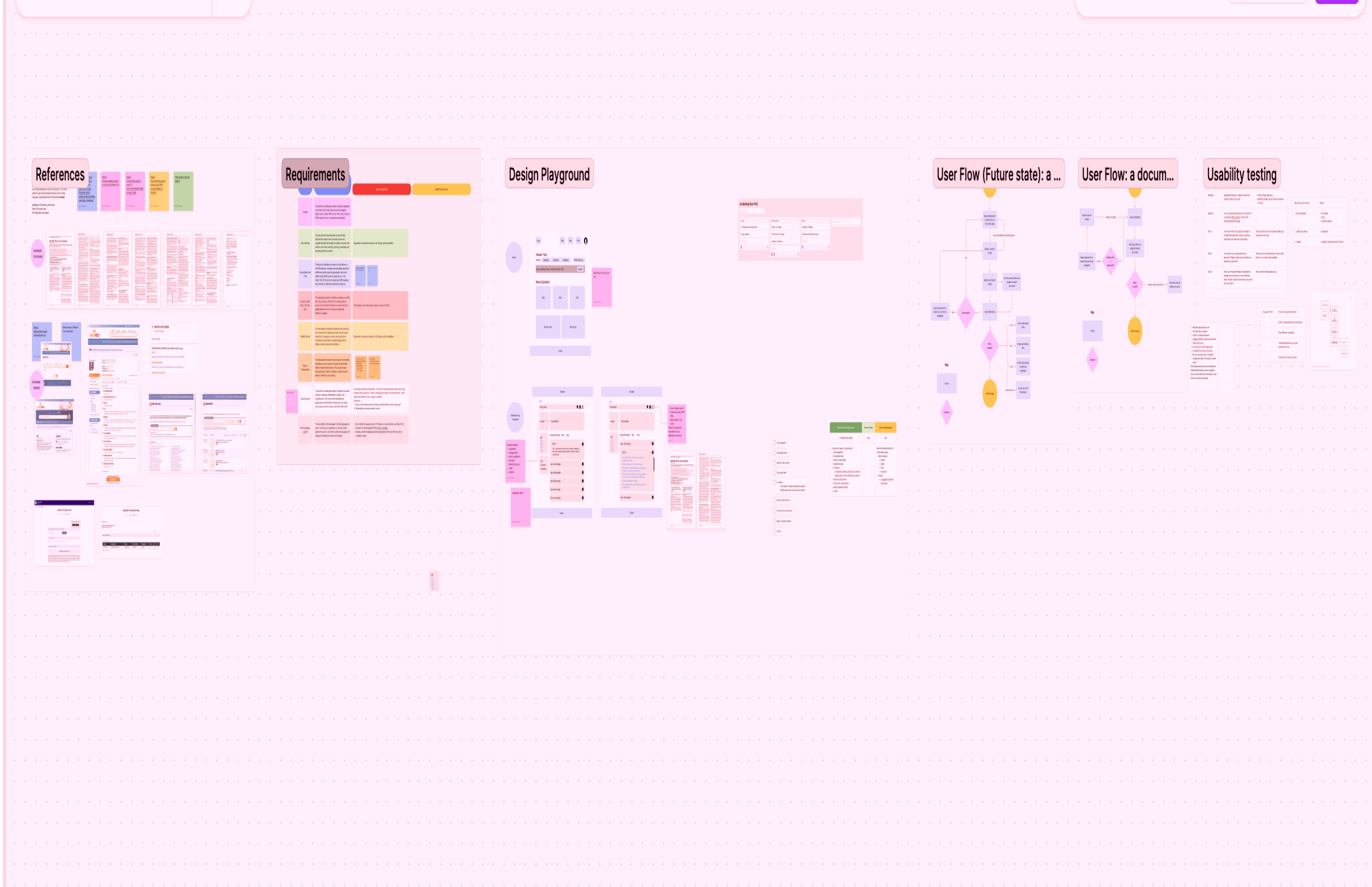
With no prior UX investment, the temptation was to jump straight to screens. Instead, I partnered with the Project Manager to set up a lightweight research and testing process first — even a minimal framework prevented the kind of rework that kills POC timelines. Research and design ran in tight, and fast loops.

Engineering was looped in from day one — design and build iterated together, which surfaced technical constraints early and meant the demo was a real working prototype, not just a Figma walkthrough.

KEY DECISIONS

Evidence-led demo

The MVP proof-of-concept needed to do two things at once: demonstrate the concept works for users and give executives confidence to fund the next phase. Usability test results showing 100% task completion became the core of the stakeholder narrative.

RESULTS

User Impact

100% task completion - Core workflows were learnable without training, validated fundamental interaction design. Proxy user testing confirmed navigation patterns and information architecture were intuitive.

Delivered Business Outcomes

Design work provided stakeholders with compelling demos and materials to present to larger leadership groups for funding approval. I delivered on the goal of this project, which was to design and deliver a demo product that works at the MVP level and beyond.

Proved Technical Feasibility

Real-time database integration and multi-database architecture validated the concept was buildable. Concept proved within 4 months - built in close collaboration with engineering from day one.

Strong Usability Metrics

SUS score of 82/100 and 4.2/5 satisfaction indicated solid foundation for further development.

RETROSPECTIVE

  • WHAT WORKED
  • Engineering from day one—streamlining the design-build process was the main reason the POC met the schedule without compromising quality.
  • Designing the complete vision and working with stakeholders to distinguish what proves the concept from what gets roadmapped. It's understanding that a focused POC enables future investment.
  • WHAT I'D CHANGE
  • I would have pushed for more usability test sessions across a wider range of HCP specialties — the participant pool was limited by timeline and access, and broader coverage would have strengthened the evidence.
  • Accessibility at Each Phase - Some improvements (like search highlight contrast) required late-stage rework. WCAG compliance checks should happen at each design phase, not primarily during testing.

TESTIMONIALS

  • Michael Phillips

    UX Writer / Content Strategist at Optum

    "Mara is a fantastic designer. I’m a content designer, UX writer, and Mara mega-fan. We worked together on multiple projects together at Optum from complex user flows with tricky stakeholder requirements to a redesign of our website’s main strategy and entry points. Mara was consistently curious, receptive, insightful, and productive. I would work with her again in a heartbeat."

    Matthew Cooper

    Product Manager at National Grid

    "I would definitely recommend Mara. I have worked with her at The Hartford, and while on the team with her, I observed that she has great design ideas, she is highly motivated and has a great attitude for pushing great design. She is approachable, asks the right questions to fully understand the assignment at hand, and is a great addition to the team."

  • Kate Hitchcock

    Senior UX Designer at Optum

    "Holy smokes, every now and then you come across a teammate who just blows expectations out of the water and DELIVERS! Mara is one such person. We brought Mara in to help deliver on a highly visible product with a seriously challenging timeline in complex space with an impact to millions of users. Mara showed a balance of curiosity, problem solving and tactical execution that outshines many people with more senior titles and I can truly say we could not have launched without her. Added to that, Mara is truly delightful human and partner to work with. I recommend her without hesitation."

    "Holy smokes, every now and then you come across a teammate who just blows expectations out of the water and DELIVERS! Mara is one such person. We brought Mara in to help deliver on a highly visible product with a seriously challenging timeline in complex space with an impact to millions of users. Mara showed a balance of curiosity, problem solving and tactical execution that outshines many people with more senior titles and I can truly say we could not have launched without her. Added to that, Mara is truly delightful human and partner to work with. I recommend her without hesitation."

Read Case Study - Behavioral Health Platform Redesign

Let’s work together.

I always look for more opportunities to collaborate, whether through a corporate role or by supporting my local community. If you're a local independent business owner seeking to transform your website or refresh your branding assets, reach out at marasuwannawat@gmail.com

Mara Suwannawat

is a product designer, based in Massachusetts, USA.

Resume

Phone

© 2026 All Rights Reserved

Work

About

Case Study | Johnson & Johnson Innovative Medicine | 2024

Transformed

1,000+ pharmaceutical documents into an intuitive digital experience

How partnering with a PM to establish UX from scratch, I designed and validated a proof-of-concept dual-audience medical information application — transforming static PDF downloads into a searchable, filterable app embedded across J&J sites for patients and HCPs — in 4 months, in time for an executive-level demo.

MVP Proof of Concept

Pharma / MedTech

Dual Audience

Usability Testing

Responsive Design

Engineers Collaboration

Figma

100%

TASK COMPLETION

Across all usability test sessions

Demo Delivered

POC TIMELINE

Discovery through exec-ready demo

2 audiences

USER TYPES

Patients + HCPs — same UI, distinct content

Day 1

ENG PARTNERSHIP

Design & build ran in parallel

Cityscape

FRAMEWORK

My Role

UX Designer — first UX investment on this product

Team

1 UX Designer (me) · 1 strategist / PM · engineering team · J&J medical and regulatory SMEs

Methods

User research, usability testing, rapid prototyping, iterative design-build collaboration with engineering

Users

Patients seeking medication information · Healthcare providers (HCPs) needing full clinical / scientific data

Success Metrics

100% task completion in usability testing · stakeholder-ready demo validated for executive presentation

Process Arc

Research → UX process setup → concept → design-build iteration → usability testing → POC demo → executive presentation

DESIGN PROCESS

My strategic approach

BEFORE → AFTER

  • Before
  • Medical information existed only as static PDF downloads — patients and HCPs had to locate, download, and manually search through documents to find what they needed
  • No search or filter capability — finding a specific medication, indication, or clinical detail meant scrolling through unstructured document content
  • No UX process existed — MVP level without research, testing, or a shared framework
  • No application to bridge patients and HCPs — two very different information needs with no unified access point across J&J sites
  • Patients and HCPs had to navigate to separate, disconnected resources to find medication or clinical information
  • No validated concept to present to executives — the product existed only as an idea without evidence it would work for users
  • Backend Issue - the engineering team figured out how to pull information from multiple databases and present it in a single interface with a CMS structure.
  • After
  • Replaced static PDFs with an interactive embedded application — users access medication and clinical information directly within J&J sites, no download required
  • Keyword search and category filtering built in — patients and HCPs can find exactly what they need in seconds rather than manually scanning document pages
  • Established a UX process from scratch — research, prototyping, and testing rhythm set up and running within the 4-month window
  • Designed a single embedded application serving both user types — same experience structure, content tailored by role (leaflet for patients, full scientific data for HCPs)
  • Unified entry point embedded directly in existing J&J sites — users reach relevant information without leaving the ecosystem
  • POC validated through usability testing — 100% task completion gave stakeholders the confidence to present to executives
  • Design and engineering collaborated from day one — prototype and build iterated in parallel, reducing rework and compressing the timeline

CONSTRAINTS

CMS FORMAT

We couldn't reorganize the database content because the existing information was stored in static PDFs within CMS formats — well-established formats that medical, legal, and regulatory teams were familiar with and had approved. I needed to develop a solution that met business and user needs. 

REGULATORY

Pharmaceutical content is tightly regulated. Every piece of information surfaced to patients vs. HCPs had to be medically and legally appropriate for that audience — copy, hierarchy, and content access required SME and compliance sign-off.

DUAL AUDIENCE

Designing one interface that works for two fundamentally different user types — patients who need simple, digestible leaflet information and HCPs who need full clinical and scientific depth — without making either experience feel like a compromise.

SCOPE

The application had to embed cleanly into existing J&J site infrastructure. Design decisions had to account for technical feasibility in real time — which made day-one engineering partnership non-negotiable.

TIME

Four months to develop an executive-ready demo from scratch — without any prior user experience process, existing design artifacts, or established research routines. 

KEY DECISIONS

App over PDF

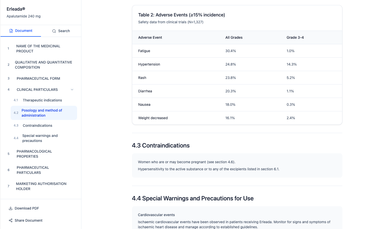
The case for the transformation had to be explicit. PDFs required download, offered no search, no filtering, and no role-based content — a patient and an HCP received the same undifferentiated document. The app gave both audiences instant access within the J&J site ecosystem, keyword search and category filtering to find information in seconds, and content tailored to their role. The usability test results — 100% task completion — became the evidence that the format change was the right call, not just a technology preference.

KEY DECISIONS

Single UI, role-based content

Building two separate apps would have doubled the scope and blown the 4-month timeline. Instead, we designed a single experience with role-based content — same structure and navigation, but patients see patient leaflet information and HCPs see full scientific data. Validated in usability testing with both groups.
KEY DECISIONS

A collaborative effort from the very beginning of the project.

With no prior UX investment, the temptation was to jump straight to screens. Instead, I partnered with the Project Manager to set up a lightweight research and testing process first — even a minimal framework prevented the kind of rework that kills POC timelines. Research and design ran in tight, and fast loops.

Engineering was looped in from day one — design and build iterated together, which surfaced technical constraints early and meant the demo was a real working prototype, not just a Figma walkthrough.

KEY DECISIONS

Evidence-led demo

The MVP proof-of-concept needed to do two things at once: demonstrate the concept works for users and give executives confidence to fund the next phase. Usability test results showing 100% task completion became the core of the stakeholder narrative.

RESULTS

User Impact

100% task completion - Core workflows were learnable without training, validated fundamental interaction design. Proxy user testing confirmed navigation patterns and information architecture were intuitive.

Delivered Business Outcomes

Design work provided stakeholders with compelling demos and materials to present to larger leadership groups for funding approval. I delivered on the goal of this project, which was to design and deliver a demo product that works at the MVP level and beyond.

Proved Technical Feasibility

Real-time database integration and multi-database architecture validated the concept was buildable. Concept proved within 4 months - built in close collaboration with engineering from day one.

Strong Usability Metrics

SUS score of 82/100 and 4.2/5 satisfaction indicated solid foundation for further development.

RETROSPECTIVE

  • WHAT WORKED
  • Engineering from day one—streamlining the design-build process was the main reason the POC met the schedule without compromising quality.
  • Designing the complete vision and working with stakeholders to distinguish what proves the concept from what gets roadmapped. It's understanding that a focused POC enables future investment.
  • WHAT I'D CHANGE
  • I would have pushed for more usability test sessions across a wider range of HCP specialties — the participant pool was limited by timeline and access, and broader coverage would have strengthened the evidence.
  • Accessibility at Each Phase - Some improvements (like search highlight contrast) required late-stage rework. WCAG compliance checks should happen at each design phase, not primarily during testing.

TESTIMONIALS

  • Michael Phillips

    UX Writer / Content Strategist at Optum

    "Mara is a fantastic designer. I’m a content designer, UX writer, and Mara mega-fan. We worked together on multiple projects together at Optum from complex user flows with tricky stakeholder requirements to a redesign of our website’s main strategy and entry points. Mara was consistently curious, receptive, insightful, and productive. I would work with her again in a heartbeat."

    Matthew Cooper

    Product Manager at National Grid

    "I would definitely recommend Mara. I have worked with her at The Hartford, and while on the team with her, I observed that she has great design ideas, she is highly motivated and has a great attitude for pushing great design. She is approachable, asks the right questions to fully understand the assignment at hand, and is a great addition to the team."

  • Kate Hitchcock

    Senior UX Designer at Optum

    "Holy smokes, every now and then you come across a teammate who just blows expectations out of the water and DELIVERS! Mara is one such person. We brought Mara in to help deliver on a highly visible product with a seriously challenging timeline in complex space with an impact to millions of users. Mara showed a balance of curiosity, problem solving and tactical execution that outshines many people with more senior titles and I can truly say we could not have launched without her. Added to that, Mara is truly delightful human and partner to work with. I recommend her without hesitation."

    "Holy smokes, every now and then you come across a teammate who just blows expectations out of the water and DELIVERS! Mara is one such person. We brought Mara in to help deliver on a highly visible product with a seriously challenging timeline in complex space with an impact to millions of users. Mara showed a balance of curiosity, problem solving and tactical execution that outshines many people with more senior titles and I can truly say we could not have launched without her. Added to that, Mara is truly delightful human and partner to work with. I recommend her without hesitation."

Read Case Study - Behavioral Health Platform Redesign

Let’s work together.

I always look for more opportunities to collaborate, whether through a corporate role or by supporting my local community. If you're a local independent business owner seeking to transform your website or refresh your branding assets, reach out at marasuwannawat@gmail.com

Mara Suwannawat

is a product designer, based in Massachusetts, USA.

Resume

Phone

© 2026 All Rights Reserved